<?xml version="1.0" encoding="utf-8"?>
<rss version="2.0">
<channel>
<title>Design Remote Jobs | Find Remote Graphic Designer Job Positions</title>
<link>https://www.designremotejobs.com</link>
<description>Find remote graphic design jobs worldwide. Browse hundreds of remote positions for graphic designers, UI/UX designers, and creative professionals. Work from anywhere.</description>
<lastBuildDate>Mon, 27 Jul 2026 03:56:35 GMT</lastBuildDate>
<docs>https://validator.w3.org/feed/docs/rss2.html</docs>
<generator>https://github.com/jpmonette/feed</generator>
<language>en</language>
<image>
<title>Design Remote Jobs | Find Remote Graphic Designer Job Positions</title>
<url>https://www.designremotejobs.com/images/logo-512.png</url>
<link>https://www.designremotejobs.com</link>
</image>
<copyright>All rights reserved 2024, DesignRemoteJobs.com</copyright>
<category>Bitcoin News</category>
<item>
<title><![CDATA[Apple TV's Neuromancer Poster Sparks Debate: Will the 'Unfilmable' Cyberpunk Classic Finally Get Its Due?]]></title>
<link>https://www.designremotejobs.com/article/apple-tvs-neuromancer-poster-sparks-debate-will-the-unfilmable-cyberpunk-classic-finally-get-its-due</link>
<guid>apple-tvs-neuromancer-poster-sparks-debate-will-the-unfilmable-cyberpunk-classic-finally-get-its-due</guid>
<pubDate>Sun, 26 Jul 2026 18:00:44 GMT</pubDate>
<description><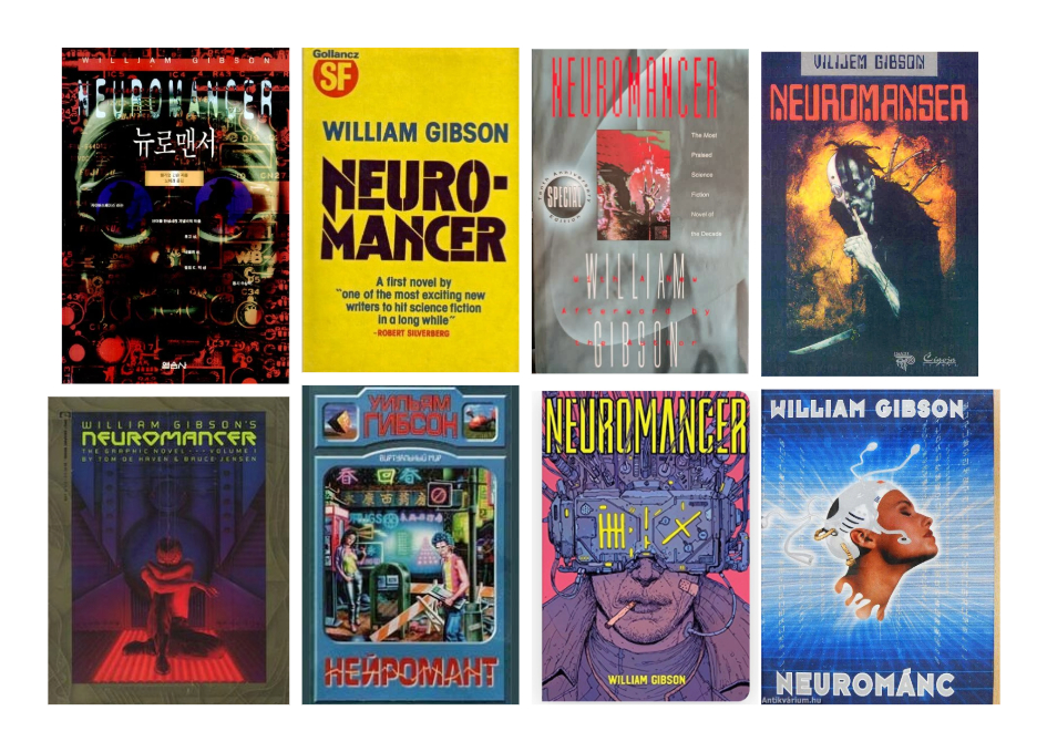
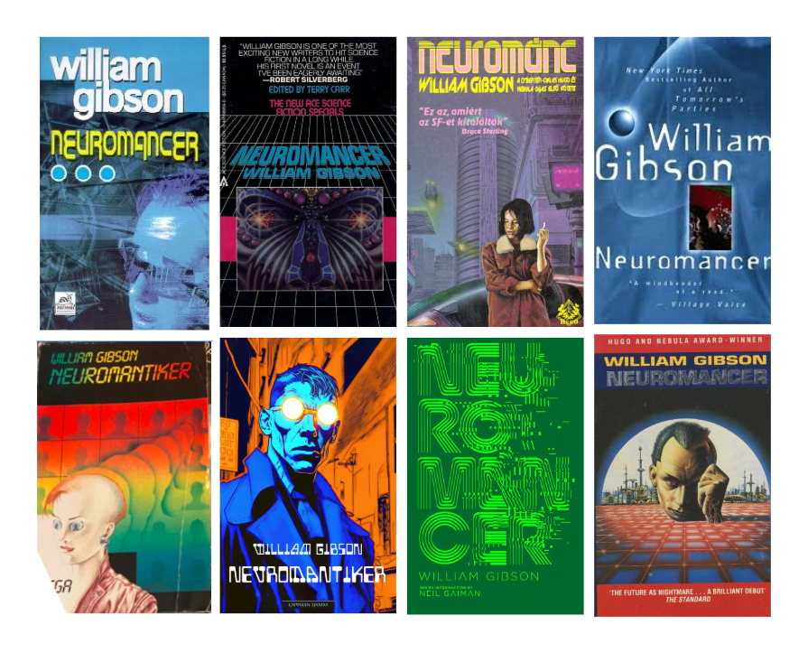
There have been many dozens of editions of *Neuromancer* published in many languages. The cover art has varied dramatically, from the gritty comic-like artwork of Josan Gonzalez for a Brazilian edition to surreal illustrations that could have appeared on any number of rave flyers in the '90s to Gollancz's trademark plain-yellow cover.
One thing that has united most cover designs is a general consensus that the title needed to appear in a **futuristic font**, and that the font might have the power to say more than any image.
As for the image in Apple TV's poster design, the gritty, tactile quality feels perfect for Gibson's grimy dystopian vision. But its subject is generating debate.
The poster appears to show a **port or jack implanted behind someone's ear**. In the novel, Case used electrodes to connect to cyberspace, not an implanted plug.
Is the person in the image someone else, then? Over on Reddit, some people suggest it might be the software booth worker **Larry**. In the novel, he was described as having a bunch of neural sockets for chips called microsofts. But would Apple put a relatively minor character on the poster? It seems more likely that the series might **change some of the tech** from the novel.
That wouldn't necessarily be a bad decision. Some of the future that Gibson imagined has already happened – perhaps because of how popular *Neuromancer* was among computer science students. But there are also details like payphones and physical media that make the novel feel anachronistic.
**Updating the tech** for a world where we already have mobile phones, VR headsets, and companies testing implantable brain-computer interfaces could allow the series to present the story in a way that makes it still feel like a plausible near future for today's world.
While some of the details of *Neuromancer* have dated, the story is as relevant as ever. The author wasn't particularly interested in the specifics of the technology but the **bigger themes** around counterculture, societal decay, and questions of morality. How Apple TV handles these will determine the success of its adaptation. If it does it well, there's plenty more for it to explore with the other two novels in the **Sprawl Trilogy**.
No precise release date has been announced, but *Neuromancer* is slated to come to Apple TV this year.]]></description>
<author>contact@designremotejobs.com (DesignRemoteJobs.com)</author>
<category>neuromancer</category>
<category>appletv</category>
<category>cyberpunk</category>
<category>posterdesign</category>
<category>sci-fiadaptation</category>
<enclosure url="https://cdn.mos.cms.futurecdn.net/qrK4L5B2F3ts8pSPEqWoLk-2000-80.jpg" length="0" type="image/jpg"/>
</item>
<item>
<title><![CDATA[How a Joke Name Became a Design Revolution: The Story of The Designers Republic]]></title>
<link>https://www.designremotejobs.com/article/how-a-joke-name-became-a-design-revolution-the-story-of-the-designers-republic</link>
<guid>how-a-joke-name-became-a-design-revolution-the-story-of-the-designers-republic</guid>
<pubDate>Thu, 23 Jul 2026 18:00:36 GMT</pubDate>
<description><![CDATA[Forty years ago, in Sheffield, Ian Anderson founded one of the most influential UK design companies by mistake. "The name the Designers Republic was a joke, because we weren't designers," he recalls. "Early on, everything we did was in black and white because we didn't know how to make it colour."
With co-founder Nick Phillips, The Designers Republic (TDR) quickly became synonymous with music, designing record covers, packaging, logos, and campaigns for everyone from **Aphex Twin** to Autechre, Pulp to Nine Inch Nails. They worked on groundbreaking video games like **Wipeout** and **Grand Theft Auto**, collaborated with brand behemoths like Coca-Cola and Adidas, and their work is held in the MoMA and the V&A.
**The Birth of a Design Powerhouse**
TDR's naive, inexperienced origins—Anderson had been in bands, Phillips was a sculpture student—didn't stop them. Their self-taught experimentations in designs for local bands soon saw them in demand. Their first big break came in 1986 with a new Sheffield record label called Fon. They created distinctive black-and-white striped spines for all Fon records, making them easily identifiable on a shelf. Inspired by **Russian constructivism**, modern art, Japanese letterform, and pop art, TDR made eye-popping work as maximal as Peter Saville's designs for Factory records were minimal.
**The Warp Years**
When the seminal label **Warp** started in 1989, TDR created its logo and a striking purple visual identity, becoming the primary driving aesthetic force behind its first 10 years. From LFO's minimal covers to the psychedelic colour explosion of Nightmares on Wax's *A Word of Science*, TDR put Sheffield on the global map as a design powerhouse.
**An Attitude of Defiance**
TDR coined the term **SoYo** (South Yorkshire) as a "fuck off to a bunch of knobs in Soho." Anderson viewed their brightly coloured, text-crammed sleeves as an antidote to the miserabilism of bands like The Smiths. "Just fucking cheer up," he says. "Council estate kids didn't want someone saying they were miserable."
Their work was so impactful that they never needed to pitch to clients. "We really didn't care what the client wanted," Anderson says. "No one was gonna jump on a train to come up and check on us."
**Postmodernism and Consumerism**
In the mid-1990s, TDR experimented with postmodernism and irony, playing with themes of capitalism and consumerism. They produced posters with slogans like **"Work. Buy. Consume. Die."** Originals now sell for thousands. Anderson says his philosophy studies influenced his approach: "A lot of our design is about asking questions."
**From Aphex Twin to Pringles**
By the 2000s, TDR worked with huge brands like Coca-Cola and Pringles, drawing criticism for "selling out." Anderson defends the move: "It gave us a lot of new opportunities and everybody has to draw the line somewhere."
**The Fall and Rise**
In 2009, TDR went into voluntary liquidation after Anderson took a back seat. "When I allowed TDR to grow beyond me, it died," he said. But it returned as a slimmed-down operation, just Anderson, continuing to make innovative work. For Aphex Twin's 2014 album *Syro*, TDR created a cover that doubled as a huge receipt for every penny spent on the album.
**The Legacy**
Now 65, Anderson is selling original TDR pieces and launching new merch. Despite the nostalgia, he's more focused on the future: "It's like having a fantastic house full of stuff, but actually preferring to sit in your shed thinking about new things."]]></description>
<author>contact@designremotejobs.com (DesignRemoteJobs.com)</author>
<category>designersrepublic</category>
<category>graphicdesign</category>
<category>albumart</category>
<category>warprecords</category>
<category>sheffield</category>
<enclosure url="https://i.guim.co.uk/img/media/9a906b564459d1de33be9e271be2a269e28b3c20/392_0_3942_3154/master/3942.jpg?width=1200&height=630&quality=85&auto=format&fit=crop&precrop=40:21,offset-x50,offset-y0&overlay-align=bottom%2Cleft&overlay-width=100p&overlay-base64=L2ltZy9zdGF0aWMvb3ZlcmxheXMvdGctZGVmYXVsdC5wbmc&enable=upscale&s=7661aa62169a61d8b3aa24a0823033ca" length="0" type="image/jpg"/>
</item>
<item>
<title><![CDATA[Imagineers Launch .YNSD: A Stealthy New Lifestyle Brand with Hidden Disney Magic]]></title>
<link>https://www.designremotejobs.com/article/imagineers-launch-ynsd-a-stealthy-new-lifestyle-brand-with-hidden-disney-magic</link>
<guid>imagineers-launch-ynsd-a-stealthy-new-lifestyle-brand-with-hidden-disney-magic</guid>
<pubDate>Tue, 21 Jul 2026 18:00:38 GMT</pubDate>
<description><![CDATA[Walt Disney Imagineering has unveiled **.YNSD**, a new lifestyle apparel and accessories brand created by a collective of Imagineers. The name is a reversal of "Disney" with vowels removed, also nodding to **Yen Sid**, Sorcerer Mickey's mentor in *Fantasia*. The brand debuts at **D23: The Ultimate Disney Fan Event** (August 14-16, Anaheim Convention Center).
## What Is .YNSD?
.YNSD is described as a **design-first brand** where materials, textures, silhouettes, and construction details carry the story instead of familiar graphics. Each collection starts from an idea, place, texture, or moment of inspiration, with hidden references that reward closer inspection.
## The First Collections
**Collection 1** sets the brand's overall look with clean silhouettes, modern essentials, and understated design. Features include tonal graphics, embroidered details, custom trims, and utility-inspired accents. Some pieces use **photochromic inks** that reveal additional graphics in sunlight, while other references are embedded in the construction itself.
**Collection 2** draws inspiration from the **Haunted Mansion Parlor** lounge aboard the Disney Treasure and Disney Destiny. It reworks Victorian textiles, layered patterns, and ornate flourishes into apparel and accessories. A custom pattern inspired by the parlor's decor includes ghostly imagery hidden in floral arrangements.
## Availability
Both collections will be available for the first time at D23. Tickets start at $49 via D23.com.]]></description>
<author>contact@designremotejobs.com (DesignRemoteJobs.com)</author>
<category>disney</category>
<category>imagineering</category>
<category>ynsd</category>
<category>lifestylebrand</category>
<category>d23expo</category>
<enclosure url="https://media.blogmickey.com/wp-content/uploads/2026/07/21100725/ynsd-wdi-collection-header-1.jpg" length="0" type="image/jpg"/>
</item>
<item>
<title><![CDATA[California Off-Grid Guest House: Stunning Views, Zero Utility Bills]]></title>
<link>https://www.designremotejobs.com/article/california-off-grid-guest-house-stunning-views-zero-utility-bills</link>
<guid>california-off-grid-guest-house-stunning-views-zero-utility-bills</guid>
<pubDate>Sun, 19 Jul 2026 18:00:40 GMT</pubDate>
<description><

This project is part of Anacapa's focus on sustainability and resilience, with more such projects in the works.]]></description>
<author>contact@designremotejobs.com (DesignRemoteJobs.com)</author>
<category>sustainablearchitecture</category>
<category>off-griddesign</category>
<category>greenbuilding</category>
<category>californiaarchitecture</category>
<category>anacapaarchitecture</category>
<enclosure url="https://imageio.forbes.com/specials-images/imageserve/6a58f239b3e3cb1bde6f084e/0x0.jpg?format=jpg&crop=1684,947,x306,y375,safe&height=900&width=1600&fit=bounds" length="0" type="image/jpg"/>
</item>
<item>
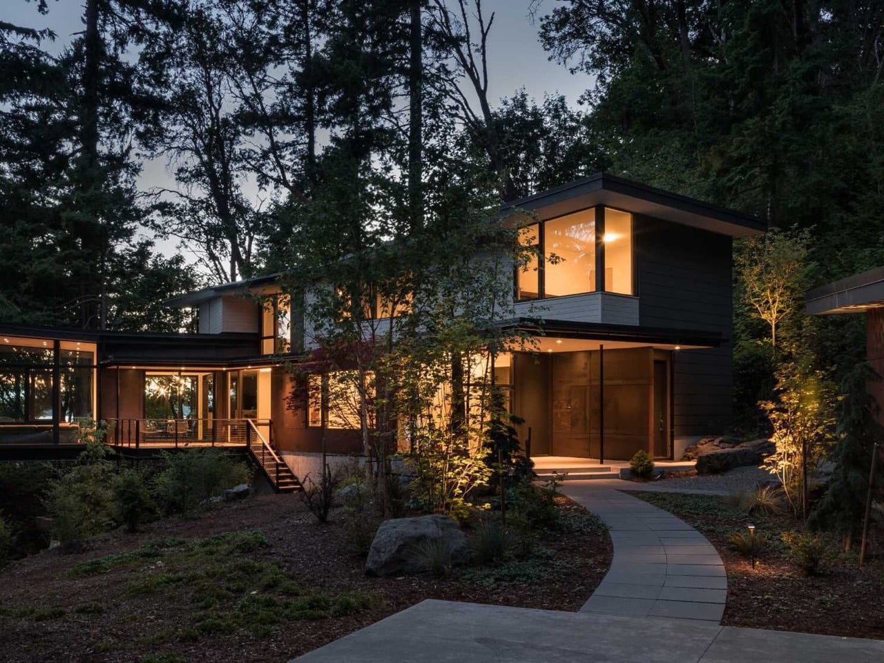
<title><![CDATA[Floating Above the Forest: A Cantilevered Washington Home Redefines Treehouse Living]]></title>
<link>https://www.designremotejobs.com/article/floating-above-the-forest-a-cantilevered-washington-home-redefines-treehouse-living</link>
<guid>floating-above-the-forest-a-cantilevered-washington-home-redefines-treehouse-living</guid>
<pubDate>Sat, 18 Jul 2026 18:00:55 GMT</pubDate>
<description><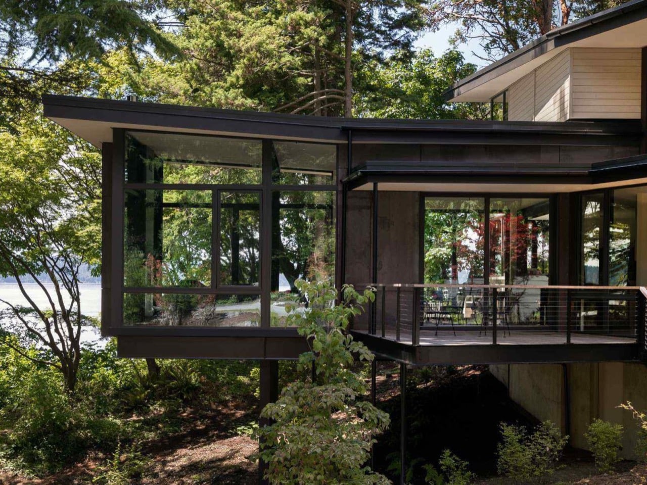
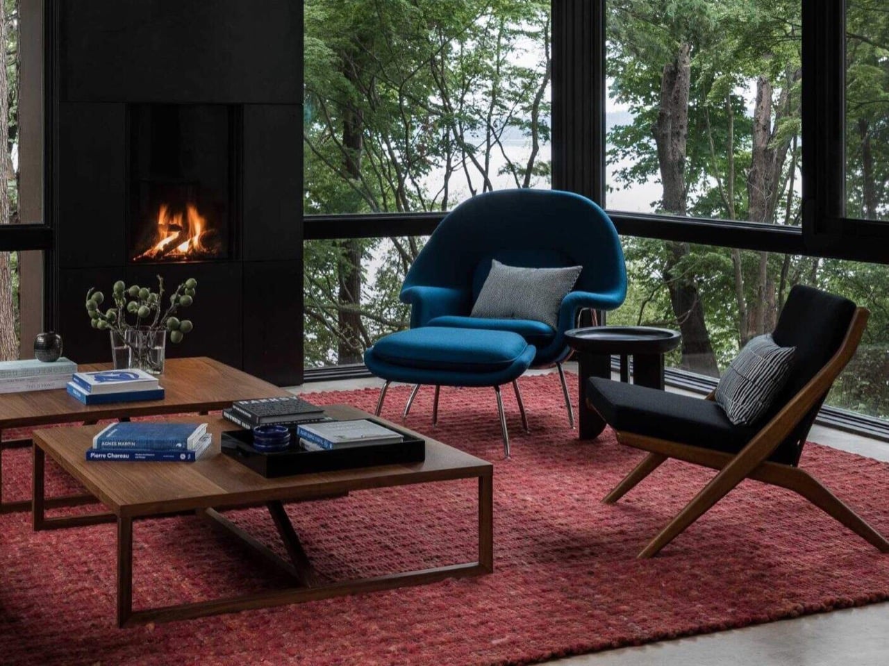
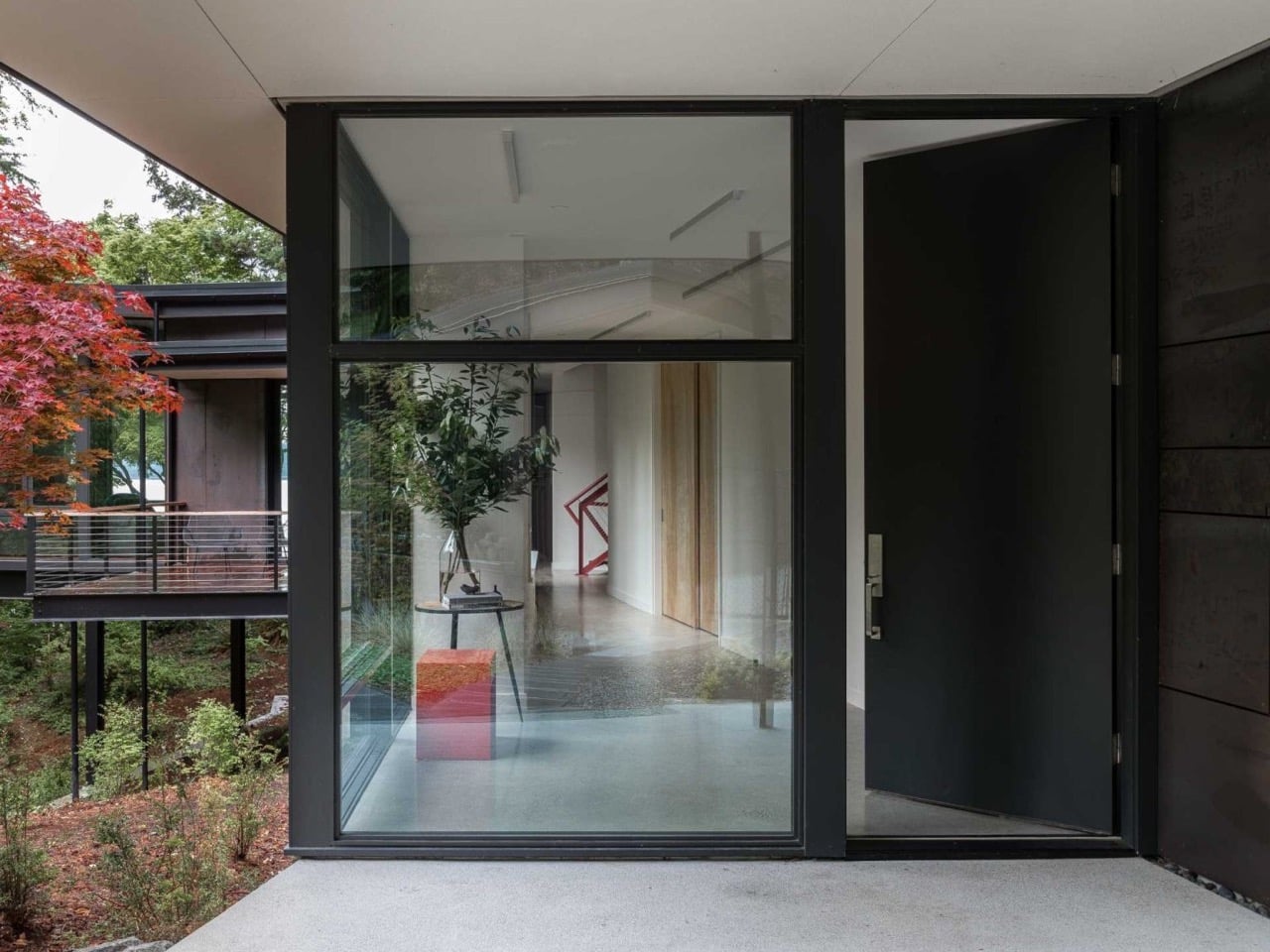
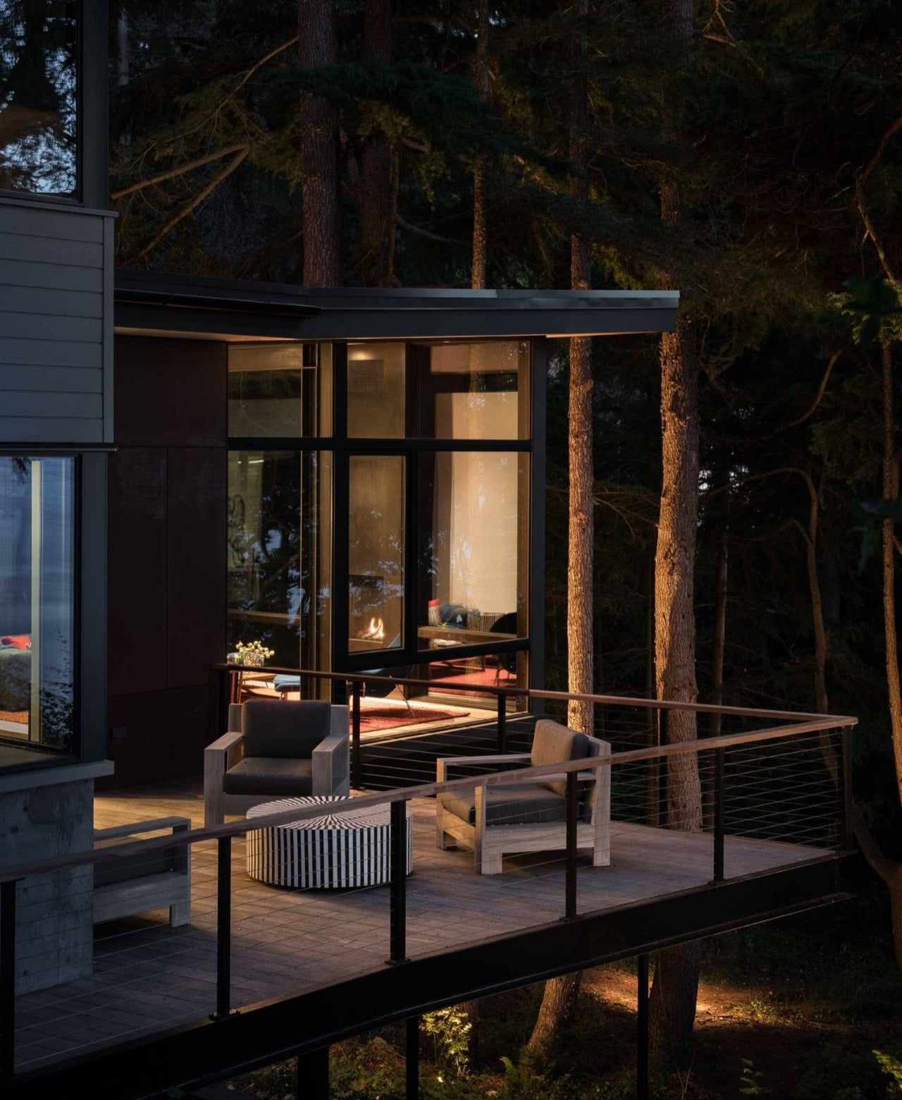
**Ore Studios** handled interiors alongside DeForest's architecture, and the two teams clearly worked in sync—the shell and furniture never feel like separate decisions. Floor-to-ceiling windows framed in thick black steel wrap the living room, turning the surrounding pines into part of the interior. Decks stretch off both sides of that suspended room: one facing a woodland meadow, the other facing open water, so the house pulls off two completely different outdoor relationships without moving a wall. A **fireplace anchors the room dead center**, and against an otherwise calm, dark palette, a red rug and a blue lounge chair do the emotional heavy lifting.
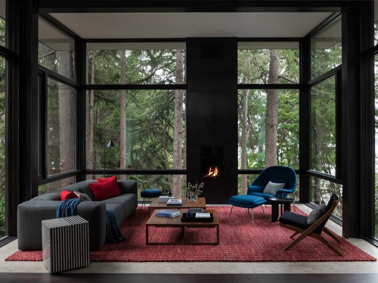
Surrounded by trees on three sides, that living room earns the treehouse comparison honestly. The owners wanted something peaceful with room for surprise—a contradiction until you see how DeForest solved it. Instead of decorative flourishes, they varied elevation and let the forest do the visual work through all that glass. A red sofa cushion, a cobalt lounge chair, and the room reads as calm and lived-in rather than staged. The **steel framing is thick enough to feel structural**, keeping the glass box from feeling fragile despite hanging in midair above the slope.
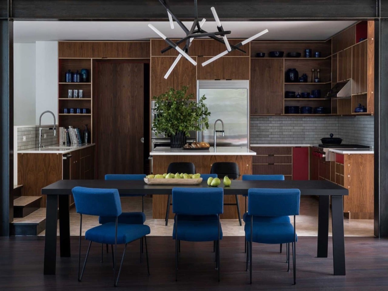
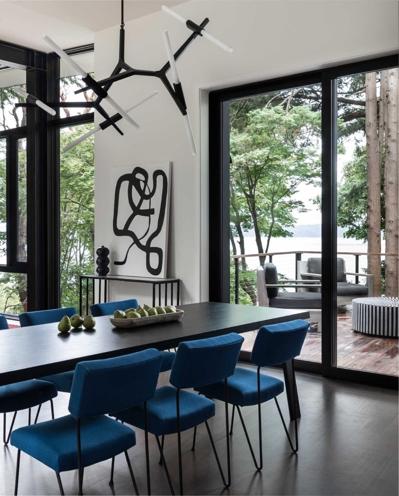
That same color language travels beyond the living room. Blue dining chairs with slim metal frames pick up where the lounge chair left off, adding personality without competing with water views. The kitchen sits just beyond, wrapped in **walnut cabinetry** that swaps the cool palette for something warmer. Red accent panels reappear, a quiet callback to the rug two rooms over—proof that DeForest and Ore Studios were working from the same script.
The most theatrical detail comes from a **staircase**. DeForest based its red steel structure on fire lookout towers that once dotted Pacific Northwest ridgelines. As it climbs through the house, the staircase echoes the actual climb up the hillside outside, turning a functional element into sculpture. Painted saturated red against white walls, it reads less like circulation and more like a commissioned art piece.
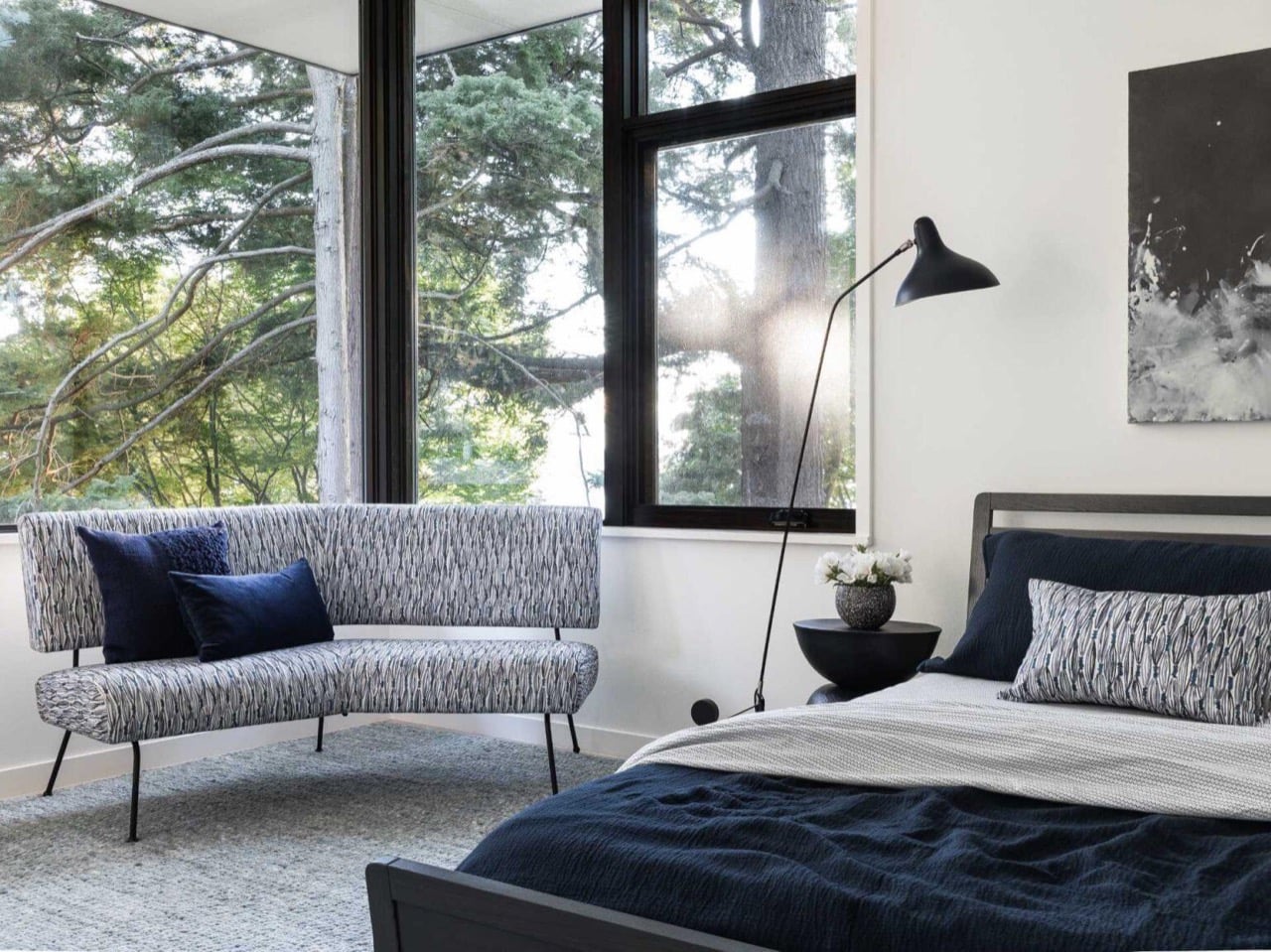
Upstairs, the bedroom dials the energy back down without abandoning the color story. Deep blues in cushions and bedding play against grey and black finishes for a restful atmosphere. Large windows keep the forest close, maintaining the connection to the site even in the most private room.

Cantilevered houses live or die by whether the drama feels earned. This one earns it. DeForest Architects and Ore Studios didn't settle for one showpiece room—they built an entire structure that renegotiates its relationship to a difficult site. The fire lookout staircase and suspended living room could each carry a project on their own, yet they coexist without stepping on each other. **Toth Construction** gets credit too, since none of this works if execution doesn't match ambition. Burien, Washington isn't known as an architecture destination, but this house makes a decent case that it should be.
]]></description>
<author>contact@designremotejobs.com (DesignRemoteJobs.com)</author>
<category>architecture</category>
<category>cantilever</category>
<category>foresthome</category>
<category>interiordesign</category>
<category>washington</category>
<enclosure url="https://www.yankodesign.com/images/design_news/2026/07/this-cantilevered-forest-home-in-washington-hovers-above-the-trees/ore_studios_forest_home_1.jpg" length="0" type="image/jpg"/>
</item>
</channel>
</rss>