Choosing the perfect color for your living room walls is a delicate balance between adding personality and maintaining a calm, livable atmosphere. This year's trends strike that balance perfectly, with interior designers sharing their favorite shades for 2026—each offering an earthy, grounding quality that makes them versatile and timeless.
1. Muted Teals
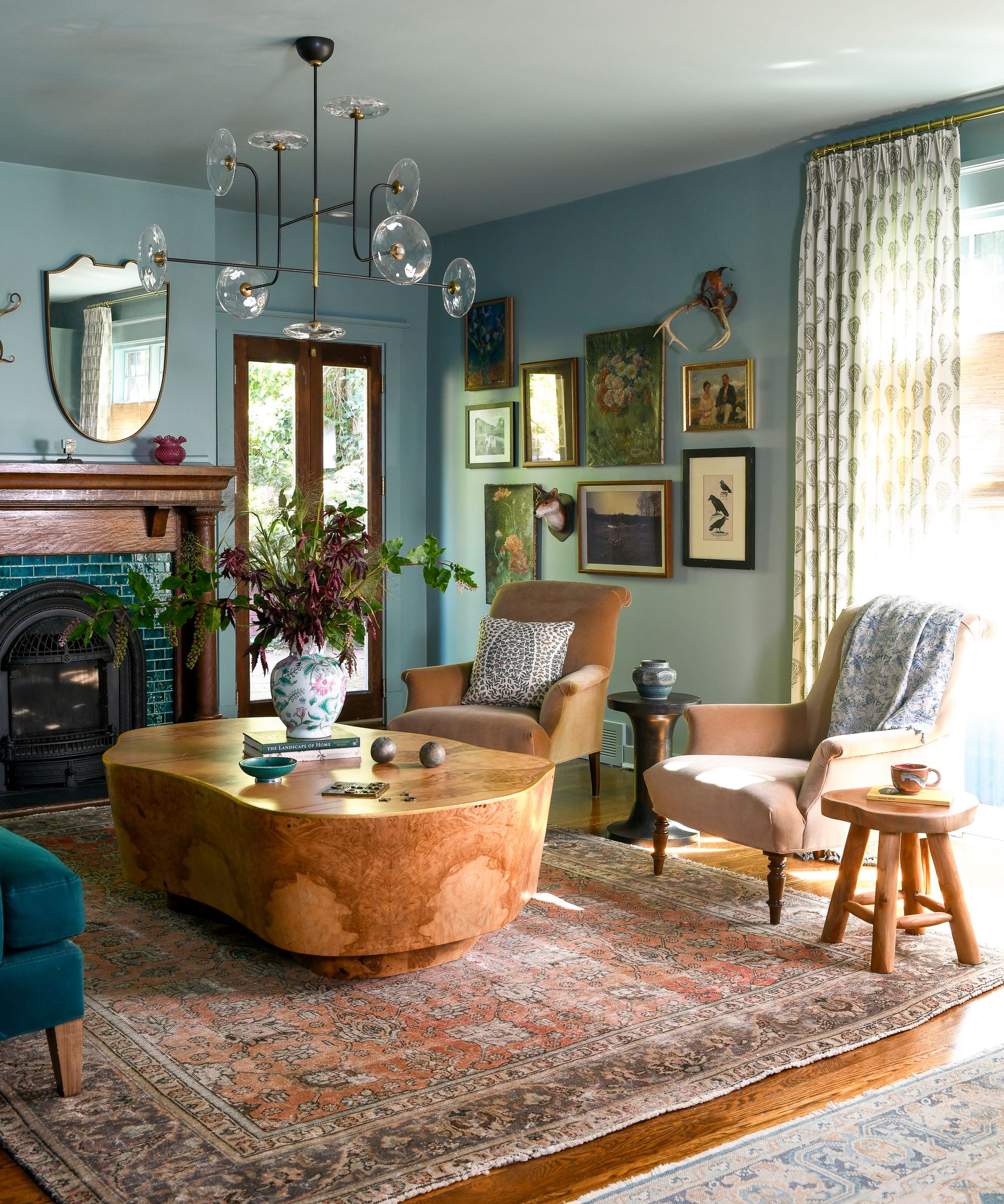
Teal has emerged as a standout color at the start of 2026, creating gorgeous, serene living rooms. This blue-green hybrid ranges from dark and moody to muted and tranquil, offering sophistication and versatility. Muted teals with gray undertones are particularly easy to layer with other colors while remaining livable.
Interior designer Michelle Gage recommends Benjamin Moore's Atmospheric and Farrow & Ball's Dix Blue, noting that teal serves as an excellent backdrop for layering patterns and colors like rich emeralds, warm caramels, and soothing pinks.
2. Dusky Pinks
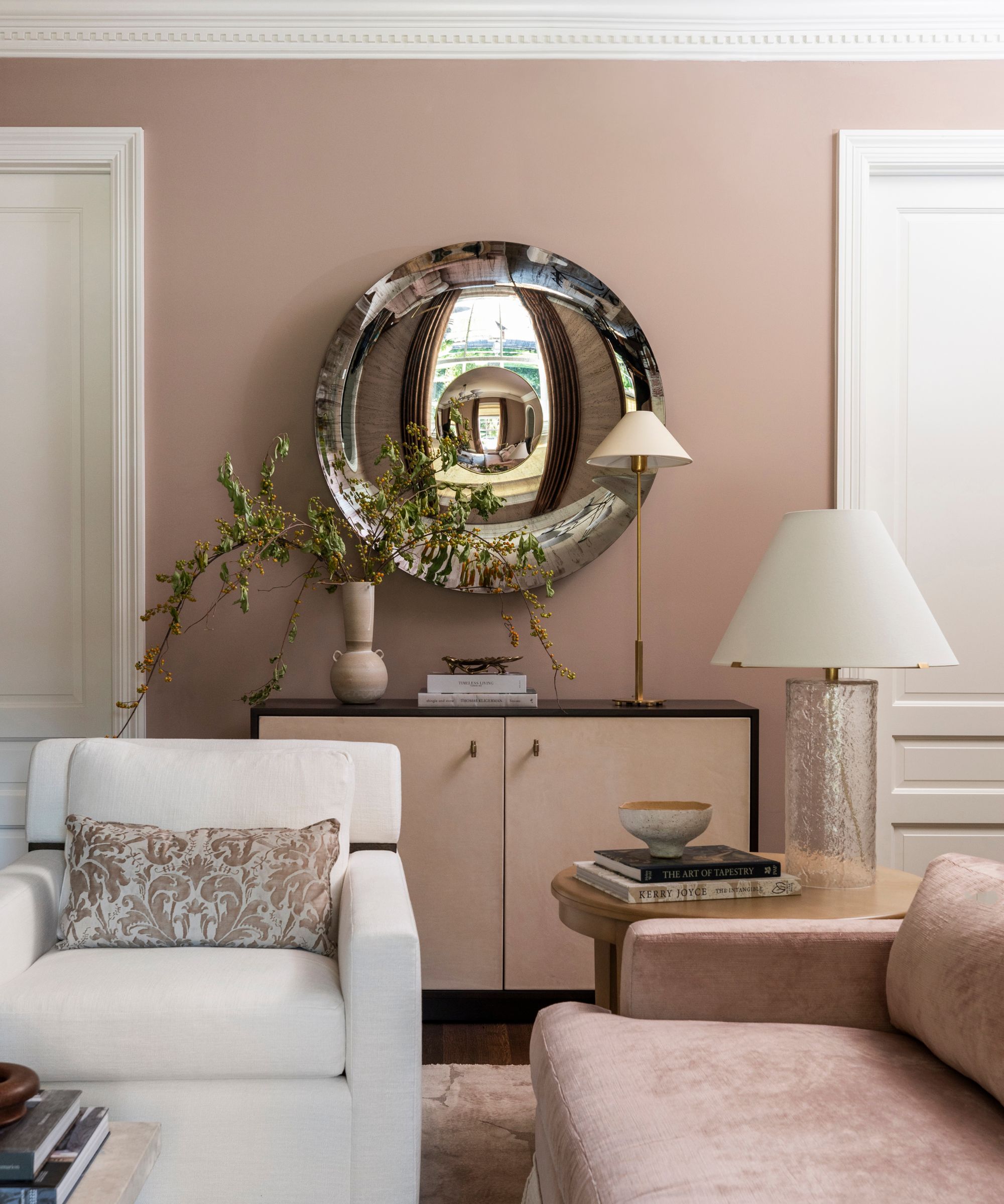
Warm color schemes in 2026 are favoring plaster pinks—muddy, dusky tones that feel sophisticated and easy to live with. These shades add more color than traditional neutrals while maintaining a balanced look.
Designer Marie Flanigan loves Farrow and Ball's Dead Salmon, describing it as "unexpected yet still functions as a neutral." Its blend of pink, brown, and earth tones adds warmth without overwhelming a space, pairing beautifully with natural materials like wood, linen, and stone.
3. Muddy Greens
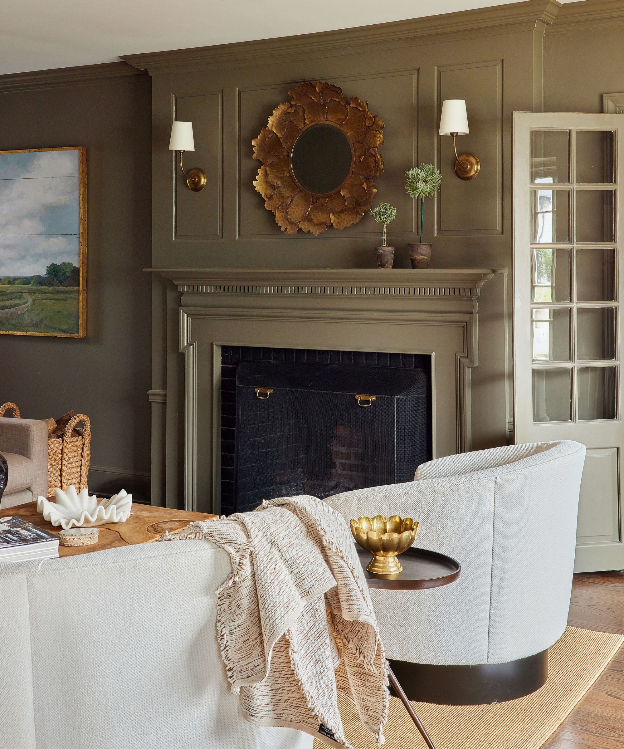
While forest greens can feel dated, designers are embracing muddy, earthy greens as stylish alternatives. These rich olive greens offer depth and read more as deep neutrals than bold colors, making them easy to layer.
Designer Jessica Hobson recommends Benjamin Moore's Gloucester Sage and Farrow & Ball's Bancha, noting that these shades are "interesting and soothing" and work well with pops of plum, pink, or pale blue. Brass accents complement their warmth perfectly.
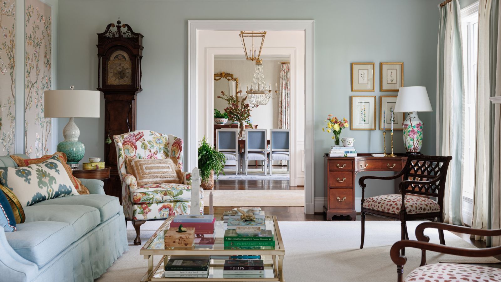
4. Light and Airy Blues
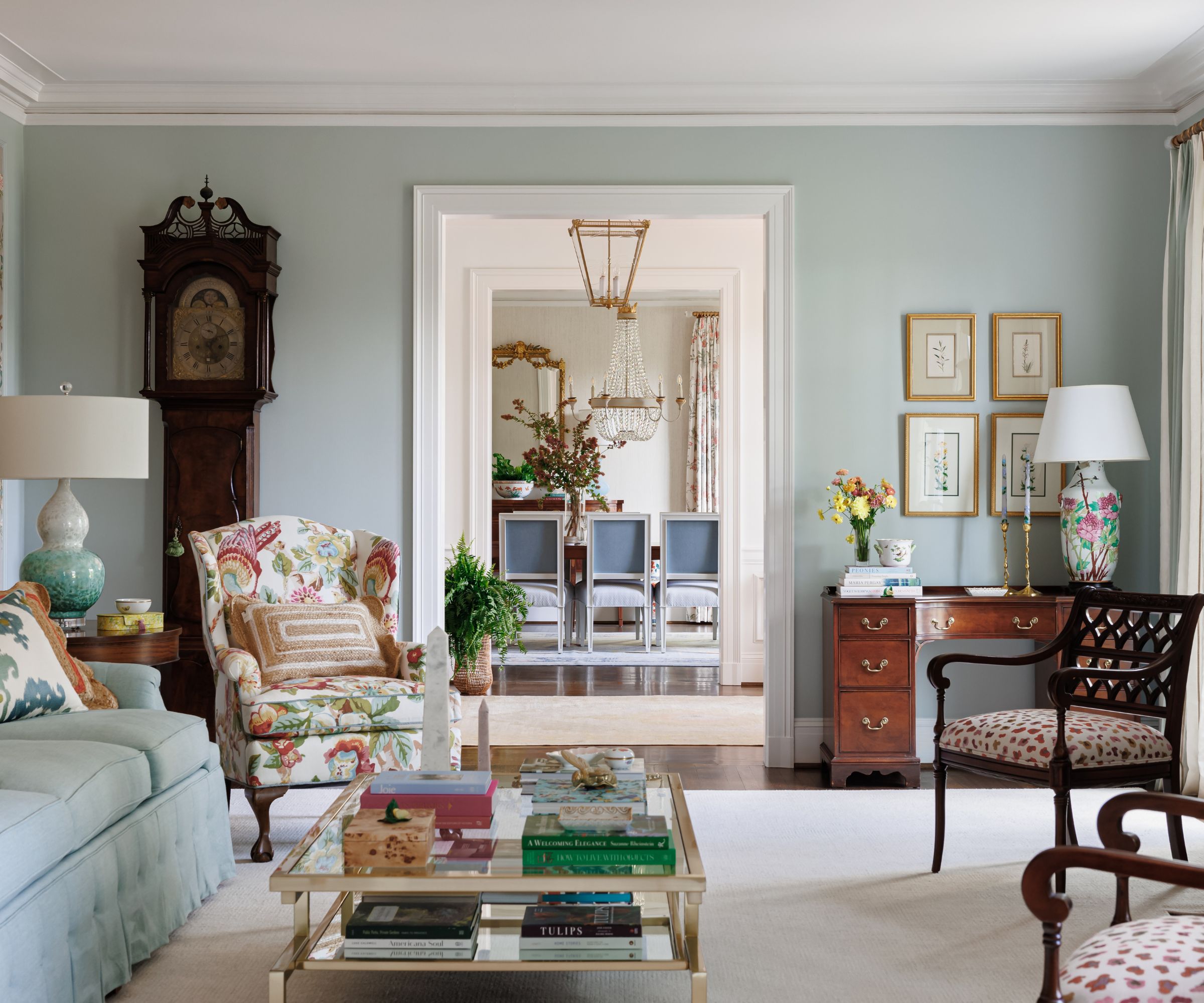
Soft blues are gaining popularity for 2026, particularly shades that feel calm, airy, and rooted in nature. Designers Sydney Foley and Emma Legg of Kindred Interior Studios explain that these colors "bring in personality without overwhelming a space" and create an instant sense of ease.
Similar to Benjamin Moore's Quiet Moments and Sherwin-Williams' Sea Salt, these muted blues work beautifully with warm woods, antique pieces, brass finishes, and various patterns. They shift throughout the day with changing light, adding dimension to the room.
5. Warm Whites

For those preferring a timeless approach, warm whites remain a classic choice for 2026. These subtler alternatives to bright whites offer softness and coziness while allowing furniture, decor, and accent colors to shine.
Designer Kate Hartman favors Sherwin-Williams' Alabaster, which "adapts beautifully to different lighting conditions" and creates a calm, inviting foundation. Andrea Goldman recommends Benjamin Moore's Seapearl and Silver Satin as versatile "whites" that aren't actually white.
Remember to sample paint colors in your space to see how they change with natural light throughout the day. This year's living room color trends focus on softly nuanced hues that feel natural, comfortable, and timeless.



Comments
Join Our Community
Sign up to share your thoughts, engage with others, and become part of our growing community.
No comments yet
Be the first to share your thoughts and start the conversation!