BMW's Stealthy Logo Evolution: A Design Masterclass in Subtlety and Brand Consistency
In recent years, numerous car brands have unveiled new logos, often following a trend of flattening designs for digital compatibility while preserving heritage. BMW was a pioneer in this movement back in 2020, with a simplified redesign that was hailed as one of the best of the decade.
However, BMW isn't done refining its iconic emblem. At the recent Munich Motor Show, the brand launched its new iX3 electric car, which not only features a bold new design language but also introduces a subtly tweaked logo. This update further refines what is considered one of the best car logos ever.
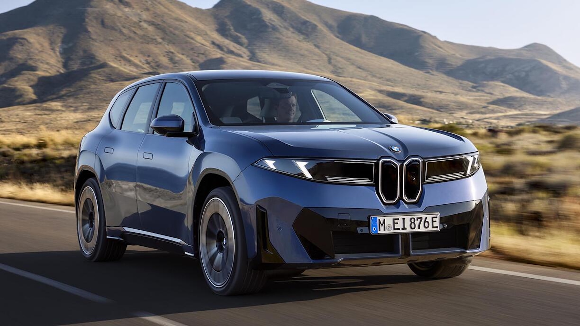 Image credit: BMW iX3
While the 2020 simplified logo has been used in advertising for years, it hadn't yet appeared on the cars themselves. The vehicle emblems remained more decorative, with chrome borders and grey dividing lines between the colors of the inner logo (which, by the way, is definitely not a propeller).
With the iX3, this changes. The new logo removes the chrome layers, resulting in a much flatter shape without borders or dividing lines. This shift went largely unnoticed by BMW fans and was only recently highlighted by Carscoops.
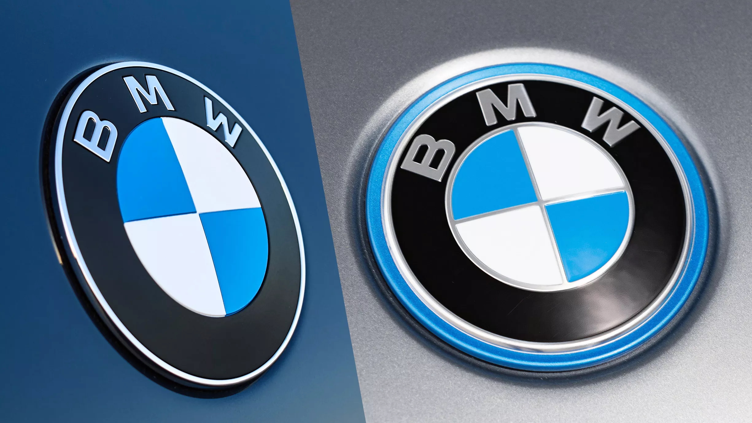 New (left) vs old (right) - Image credit: Carscoops
This update brings greater consistency to BMW's branding, eliminating discrepancies between digital and on-vehicle logos. It's a positive step towards unified brand identity, contrasting with other car brands that introduce new logos without implementing them on vehicles—like the controversial new Range Rover logo, which might be better off staying on screens.
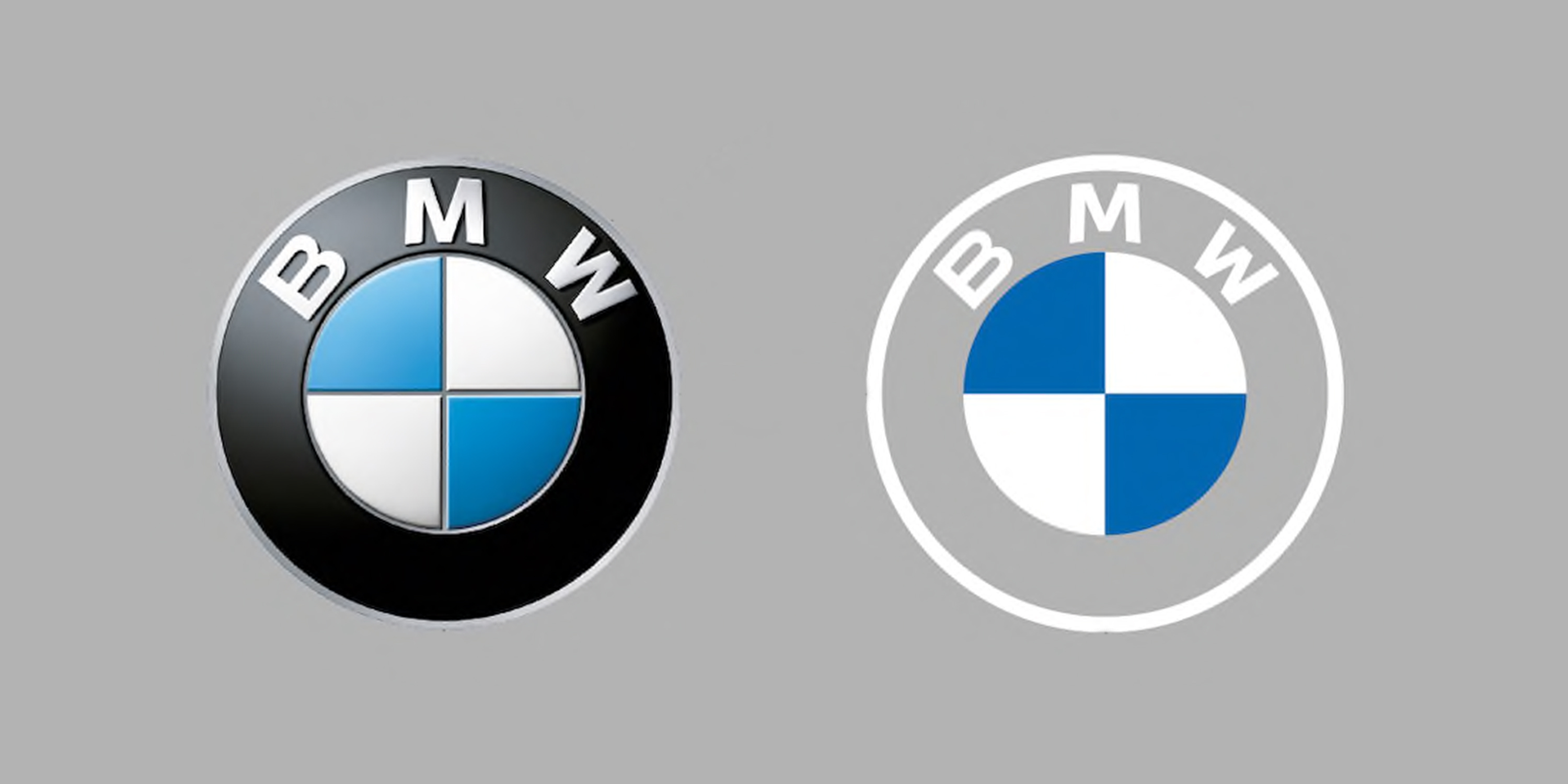 BMW revealed a new logo in 2020 - Image credit: BMW/Future Owns
This subtle yet impactful redesign showcases how even minor tweaks can enhance brand coherence and modernize a classic emblem for the digital age.


Comments
Join Our Community
Sign up to share your thoughts, engage with others, and become part of our growing community.
No comments yet
Be the first to share your thoughts and start the conversation!