The Resurgence of Cursive Logos
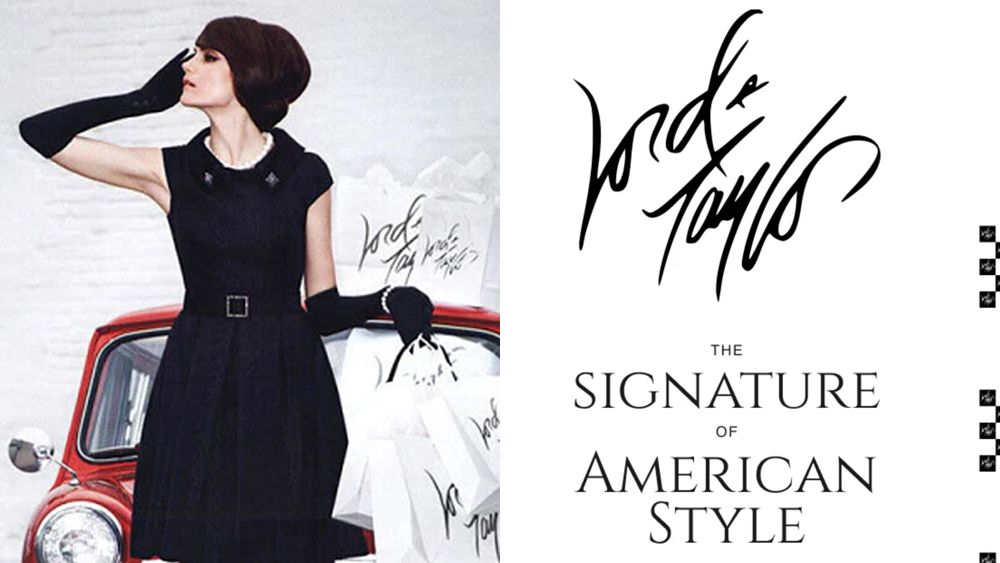
Cursive logos were declared nearly extinct in 2024, especially after brands like Johnson & Johnson abandoned their iconic script logotype, leading to claims that Gen Z struggles with reading cursive. However, the oldest retailer in the US, Lord & Taylor, is challenging that notion with a bold return to cursive branding.
The Lord & Taylor logo has undergone numerous transformations in recent years, shifting from a sweeping cursive style to a more legible version that resembled handwriting with a Sharpie marker, and finally to a sleek, modern Helvetica-based design. The new owners believe that these frequent redesigns contributed to the brand's previous struggles, and they are determined to reclaim the cursive style that once defined its identity.

As the brand reinvents itself, it highlights the enduring appeal of cursive logos and their potential to resonate with consumers again, proving that classic design elements can still hold significant value in modern branding.


Comments
Join Our Community
Sign up to share your thoughts, engage with others, and become part of our growing community.
No comments yet
Be the first to share your thoughts and start the conversation!