Taylor Swift's recent letter to fans has taken the internet by storm, not just for its heartfelt content but also for its distinctive handwriting style. But here's the twist: did Taylor actually handwrite it, or was it a font? This question has sparked curiosity among fans and designers alike.
The Font Behind the Letter
Taylor Swift is known for her meticulous branding, with each album era featuring a unique typeface that complements its theme. From handwritten styles to elegant serifs, her visual identity is as dynamic as her music. The letter in question, however, seems to deviate slightly from her usual custom fonts, leading to speculation about its origin.
Why It Matters
For designers, typography is a powerful tool for conveying emotion and personality. Taylor's choice of font (or handwriting) in her letter adds another layer to her narrative, making it a fascinating case study in branding and design.
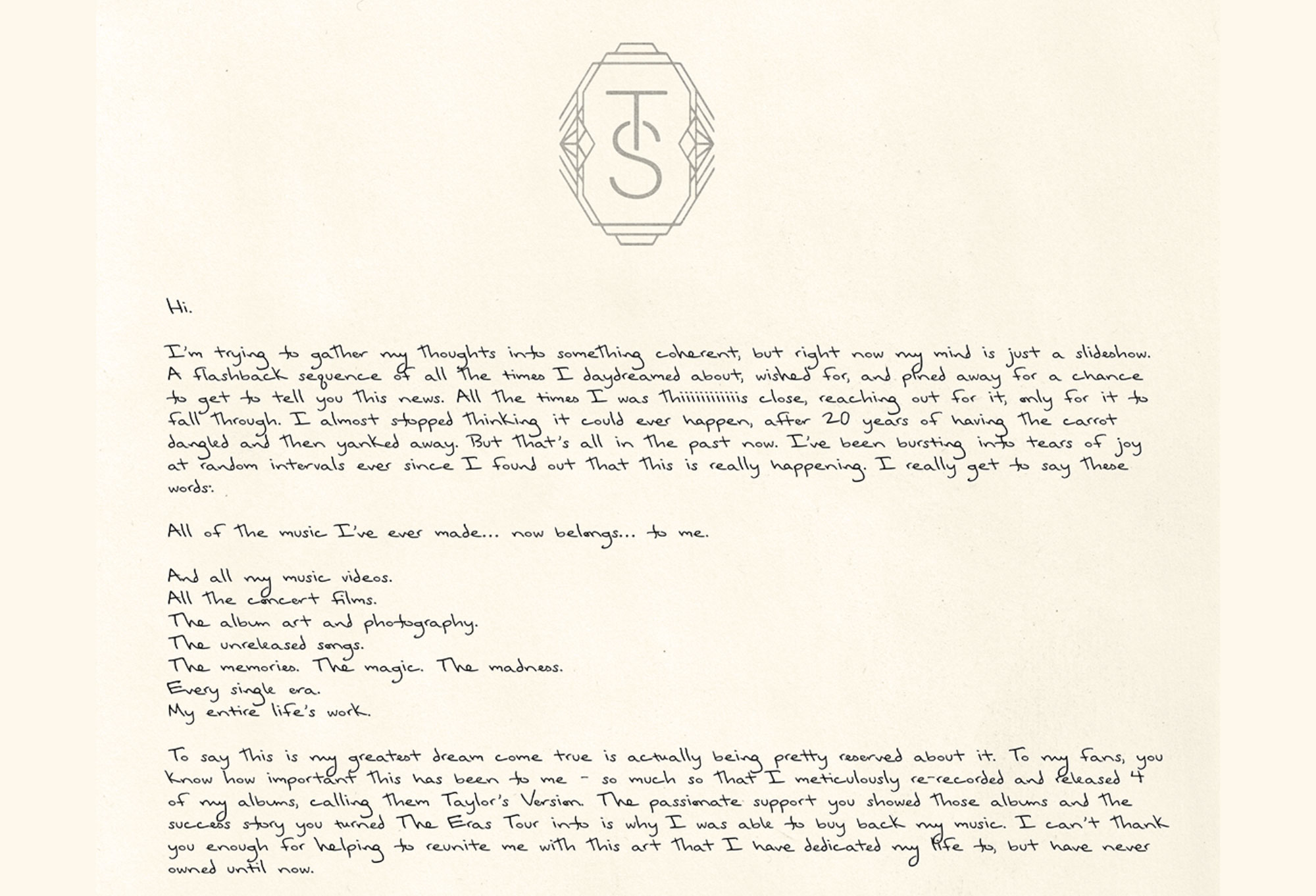
Image credit: Taylor Swift
Exploring Taylor's Typography
Each of Taylor's albums has its own signature font, carefully selected to match the era's aesthetic. This attention to detail highlights the importance of consistent and thoughtful branding in creating a cohesive identity.


Comments
Join Our Community
Sign up to share your thoughts, engage with others, and become part of our growing community.
No comments yet
Be the first to share your thoughts and start the conversation!