The Challenge: Building a Brand for a Client Who Can't See It
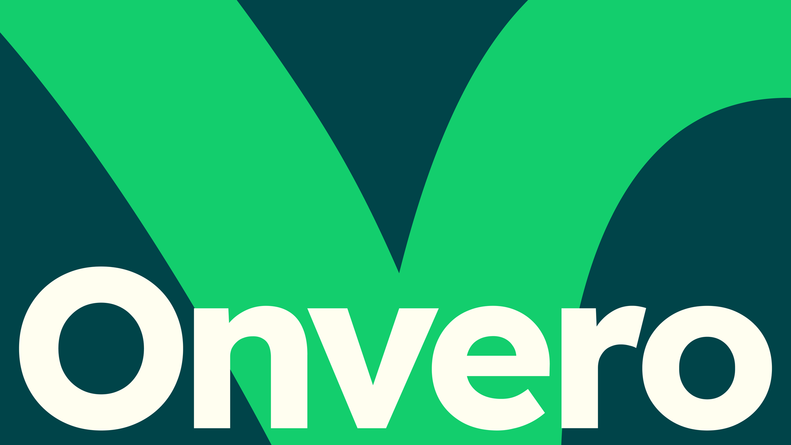
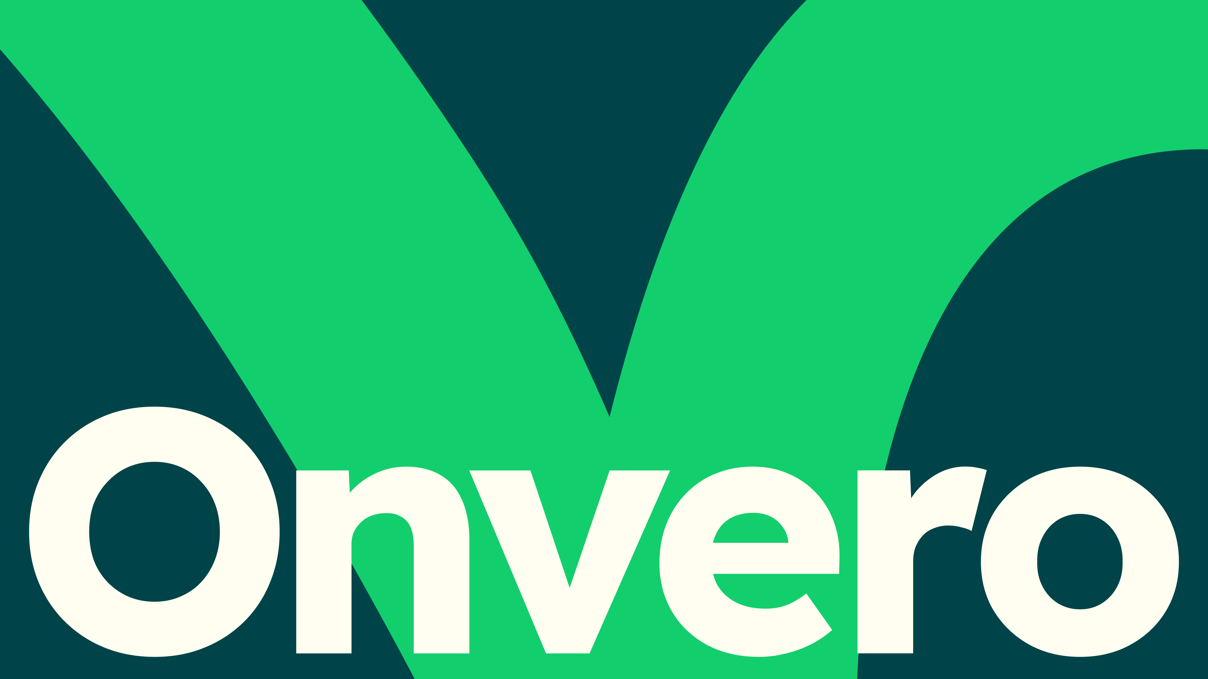
Non-profit DEI organization Onvero needed a new visual identity, but with a unique twist: its CEO, Sandi Wassmer, is blind. This presented a fascinating design challenge: how do you create a brand identity when the person leading the organization won't see it?
 (Image credit: Onvero/Something Familiar)
Accessibility is often overlooked in graphic design, but creative studio Something Familiar embraced this challenge head-on. Creative director Kane Hawkins shared insights about the tensions and lessons learned from this groundbreaking project.
Rethinking "Industry Standards"
For the Something Familiar team, the project began by placing inclusivity at the core of their thought process. "The biggest surprise was realizing how much of what we considered 'industry standard' simply wasn't accessible enough," Kane explains.
"We had assumptions baked into our process – everything from the way we present concepts, to the tools we use, how we share work and even how we describe colors. Working with Sandi's team exposed those gaps quickly. We asked, listened, and iterated far more than usual. It was humbling, but this transparency made the work better," he says.
 (Image credit: Onvero/Something Familiar)
A Complete Mindset Shift
Working with Sandi Wassmer brought a complete change of mindset. "It made us think much more carefully about how subjective and exclusive visual-first communication can be," Kane explains. "Sandi's needs influenced us to fundamentally change that communication, especially in the early stages of the project."
"Without being able to solely rely on visuals through ideation, we had to slow down and describe our ideas more clearly. Our individual interpretations of design were vastly different based on our own experiences, so we used tools and tactics to build a shared language around how we were beginning to shape the brand identity – from naming colors collectively, to crafting voice-overs for conceptual work."
 (Image credit: Onvero/Something Familiar)
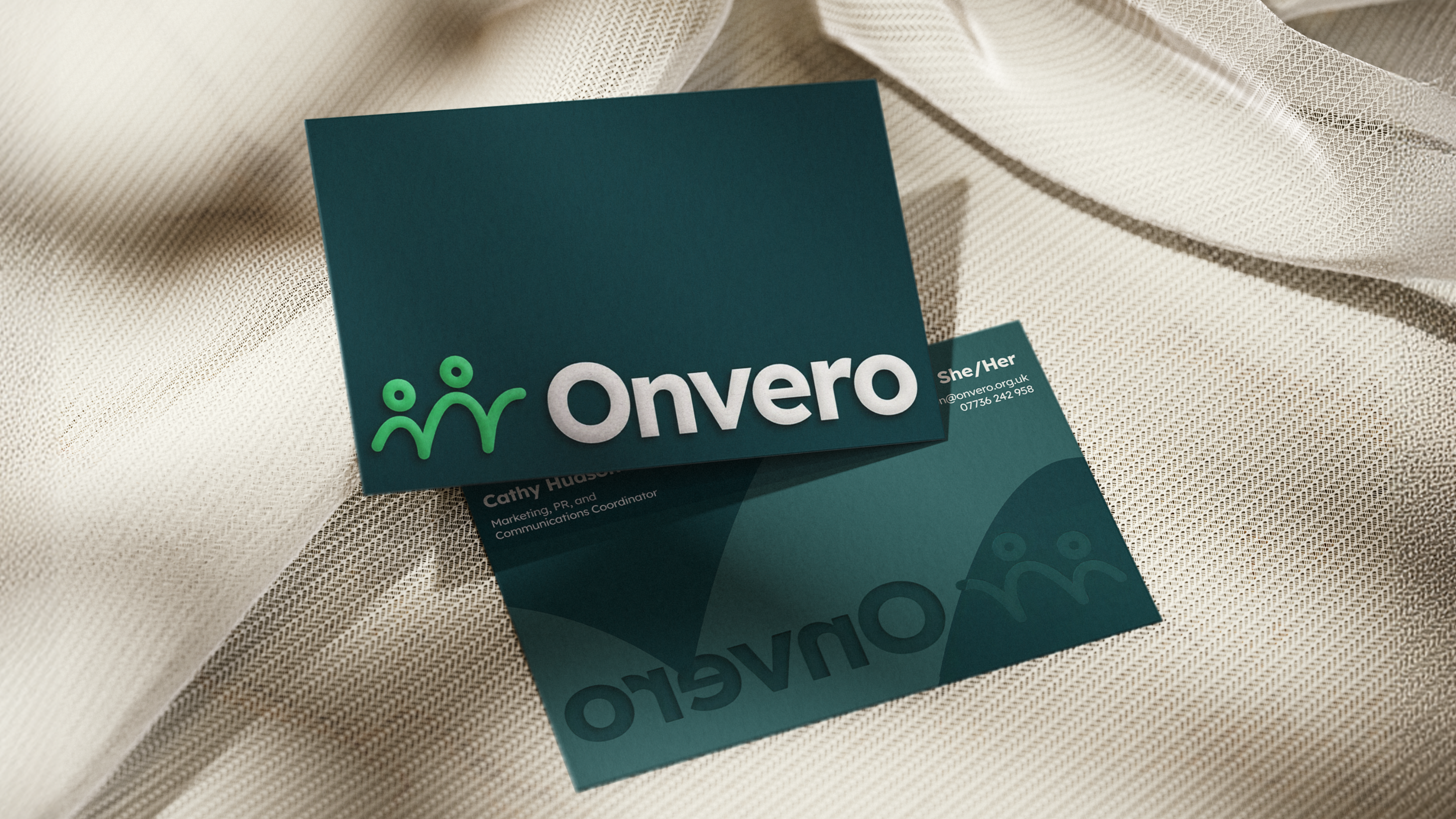
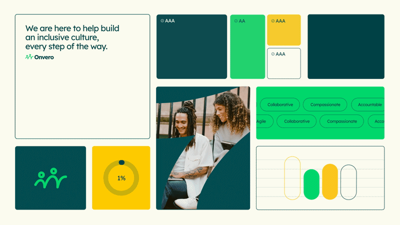
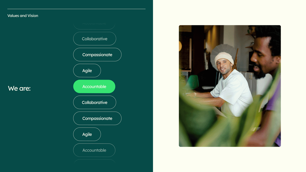
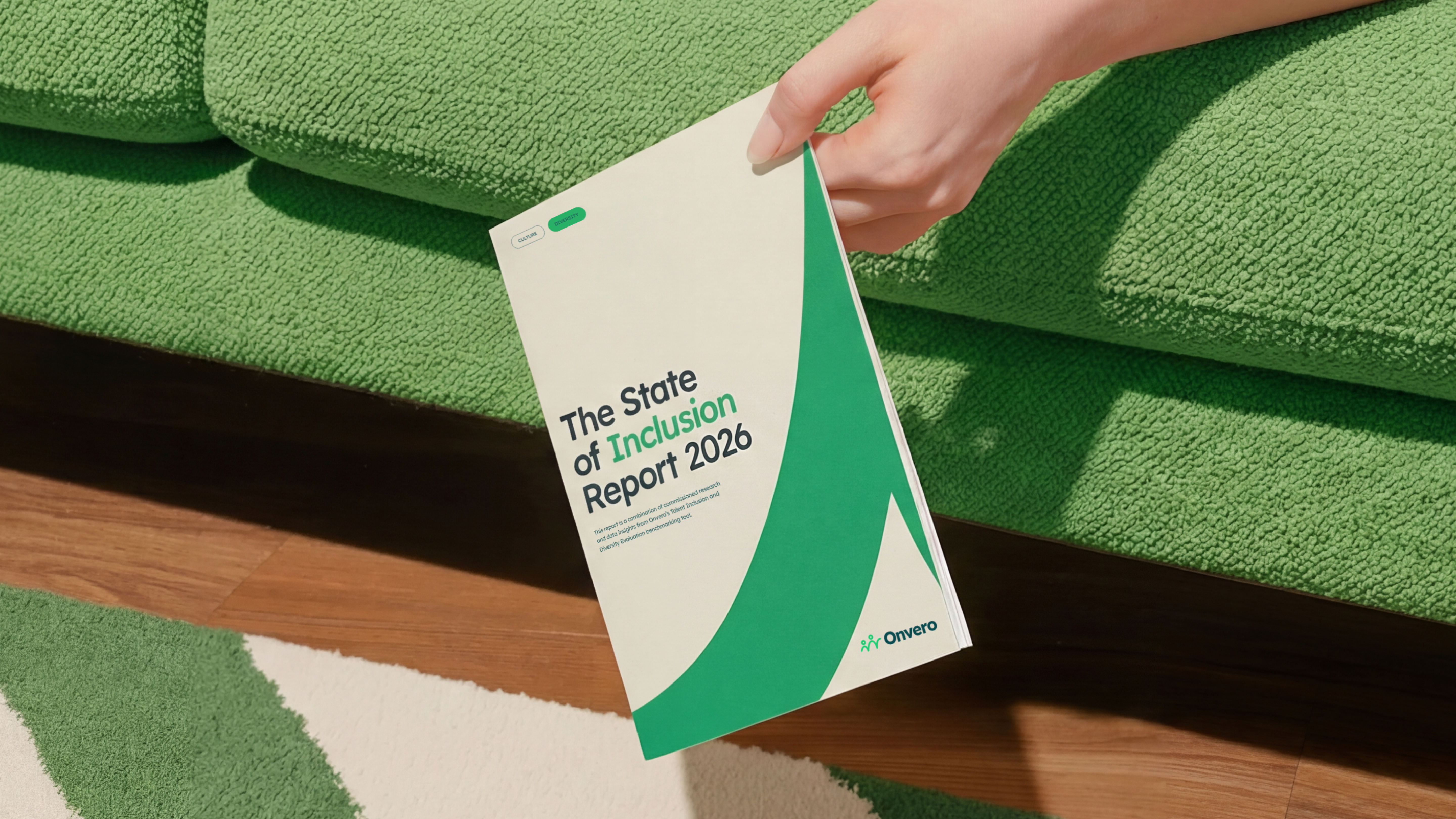
Tactile Design and Sensory Experience
Built with inclusion at its core, Onvero's new identity embraces tactile design with embossed and die-cut brand stationery. The logo was created to be easily drawn on the hand (and has since been 3D printed as a gift to the team), translating the design to those with visual impairment.
 (Image credit: Onvero/Something Familiar)
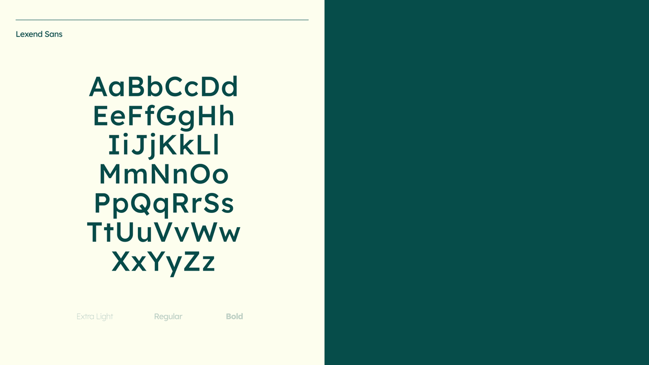
Paired with sensory-friendly presentations and the accessibility-focused typeface Lexend, the design is "rethought for an experience beyond sight."
"Tactility is encouraged where accessible, like the business cards. The color descriptions were built through AI so that a color wasn't just a hex code, but something you could communicate and imagine. None of those things exists in isolation – together they made a brand that works in a completely different dimension to most of the work our industry produces," Kane explains.
 (Image credit: Onvero/Something Familiar)
Key Lessons for the Design Industry
When asked what lessons were learned from the project, Kane reflected, "Accessibility has to be part of the conversation from day one, not a tickbox exercise towards the end stages of delivery."
"Every design decision we made on this project, from the form of the logo to the typeface, to the color palette, was shaped by accessibility requirements, and it never held us back. In fact, it made every choice more intentional. Since building the brand alongside the Onvero team, we've continued to have these conversations with other partners as early as the proposal stage, rather than leaving it to the delivery stage," Kane concludes.
 (Image credit: Onvero/Something Familiar)


Comments
Join Our Community
Sign up to share your thoughts, engage with others, and become part of our growing community.
No comments yet
Be the first to share your thoughts and start the conversation!