Goodreads has finally turned the page on its outdated design with a refreshing rebrand that's catching the eye of designers and readers alike. The Amazon-owned social reading platform, long criticized for its clunky and dated interface, has unveiled a new logo and wordmark that signal a much-needed visual upgrade.
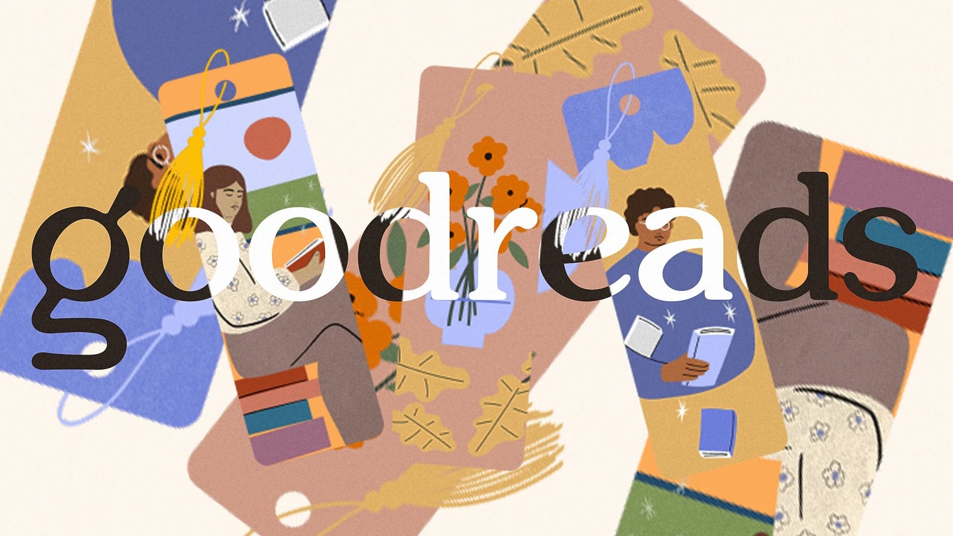
A Softer, More Stylized 'g'
The new logo retains the lowercase 'g' but introduces a softer, more stylized version compared to the previous bland sans serif. This change, along with updated typography across the platform, gives Goodreads a more friendly and literary feel, distancing itself from the look of a 2011 Wordpress blog.
More Than Just a Logo Change
While the rebrand might not be among the best of the year, it's a welcome sign that Goodreads is paying attention to its visual identity. The platform's new look suggests that further improvements to the user interface could be on the horizon, making it a more engaging space for book lovers.

What This Means for Users
The rebrand is more than just cosmetic; it's a step towards modernizing Goodreads' overall user experience. With a design that now feels more contemporary and inviting, the platform is better positioned to attract and retain users in the competitive social reading space.


Comments
Join Our Community
Sign up to share your thoughts, engage with others, and become part of our growing community.
No comments yet
Be the first to share your thoughts and start the conversation!