Google's Pixel Color Chart: A Decade of Smartphone Design Evolution
While the iPhone is about to turn 20 years old, the Google Pixel is a mere whippersnapper at just 10. With the first model released in 2016, there've now been 10 generations of the Pixel released, and to mark the occasion, Google has released a fun infographic charting the colors of every model ever released. Because the best camera phones are determined by their color, right?
 (Image credit: Google)
The pleasing color chart shows every generation as a soft gradient, revealing the general 'vibes' of each year. And the whole thing proves that while it took Apple a long time to finally embrace color, Google has always given us a few hues.
In the comments on Instagram, fans are letting Google know which color is their favorite. "I'm enjoying my Pixel 10 Pro XL in moonstone," one comments, while another declares "Coral on the 4XL, my first love". The Google Pixel 10a, revealed this week, comes in bold Lavender, Fog, and Berry shades (that's purple, green, and red to you and I), along with the standard-issue black.
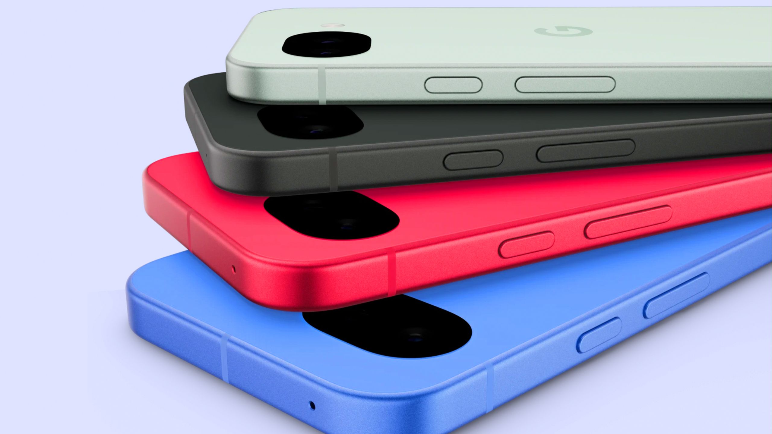
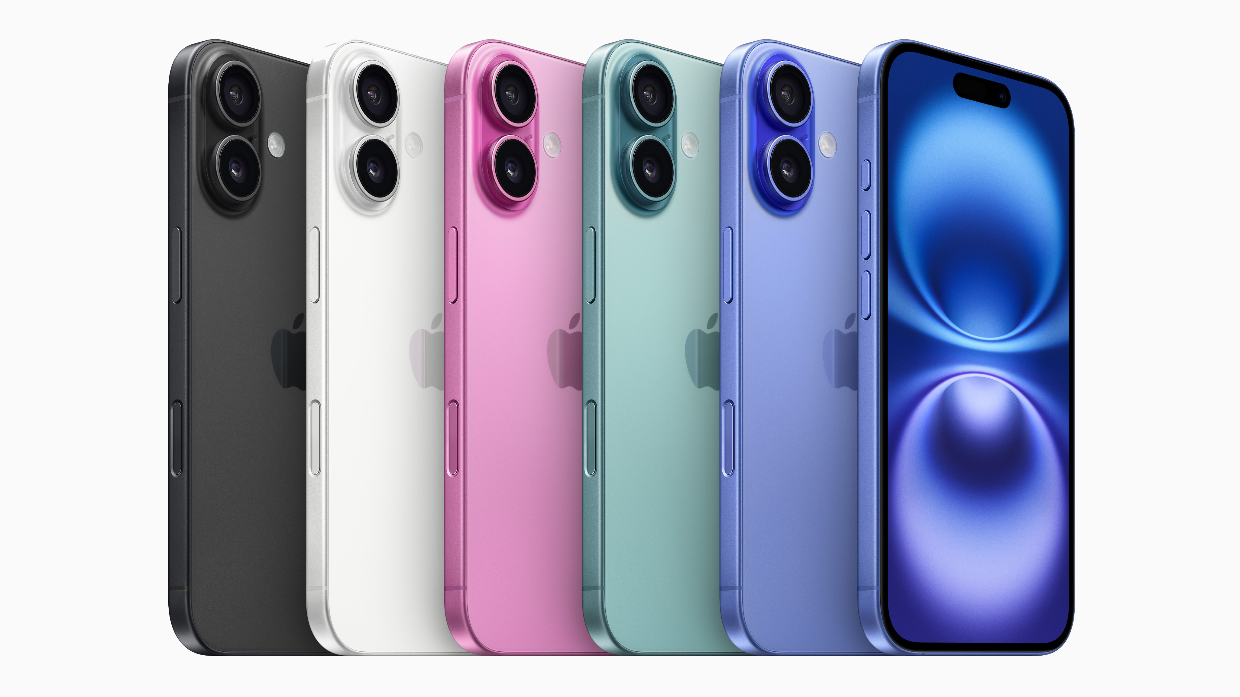 (Image credit: Apple)
The chart definitely confirms our sense that tech design is becoming a little more fun, at least when it comes to color selection. Apple's 16 and 17 lineups have offered brighter hues across the board, and with ten(!) color options for the Google Pixel 10 generation, users have never had so much choice.
But of course, the counter argument could go that with smartphone innovation stagnating, color is the only way these companies can make their phones exciting in 2026.
Daniel John is Design Editor at Creative Bloq. He reports on the worlds of design, branding, and lifestyle tech, and has covered several industry events including Milan Design Week, OFFF Barcelona, and Adobe Max in Los Angeles. He has interviewed leaders and designers at brands including Apple, Microsoft, and Adobe. Daniel's debut book of short stories and poems was published in 2018, and his comedy newsletter is a Substack Bestseller.


Comments
Join Our Community
Sign up to share your thoughts, engage with others, and become part of our growing community.
No comments yet
Be the first to share your thoughts and start the conversation!