The Power of Color in National Flags
National flags carry immense symbolic weight, often evoking pride and identity. But what happens when a design agency decides to remove the colors from one of the world's most recognizable flags? Droga5 São Paulo did just that with its Lifeless Flag campaign, creating a bold visual statement that goes beyond aesthetics to deliver a powerful environmental message.
 (Image credit: Droga5 São Paulo)
The Original Meaning Behind Brazil's Colors
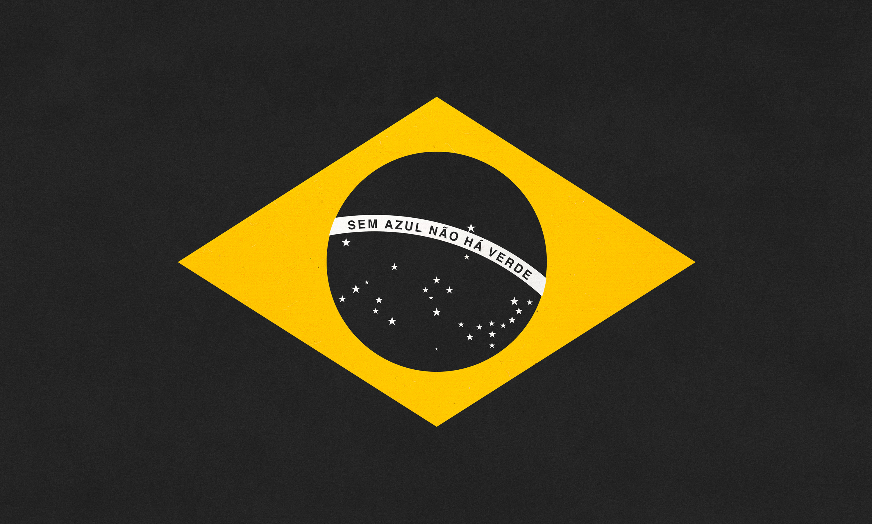
The Brazilian flag's green and yellow originally stemmed from the royal houses of Hapsburg and Braganza. Over time, these colors were reinterpreted: green represents the Amazon and Atlantic forests, yellow symbolizes gold reserves, and the blue circle depicts the night sky over Rio. But in a creative twist, Droga5 São Paulo asked: what if these colors vanished?
The Lifeless Flag Campaign: Phase One
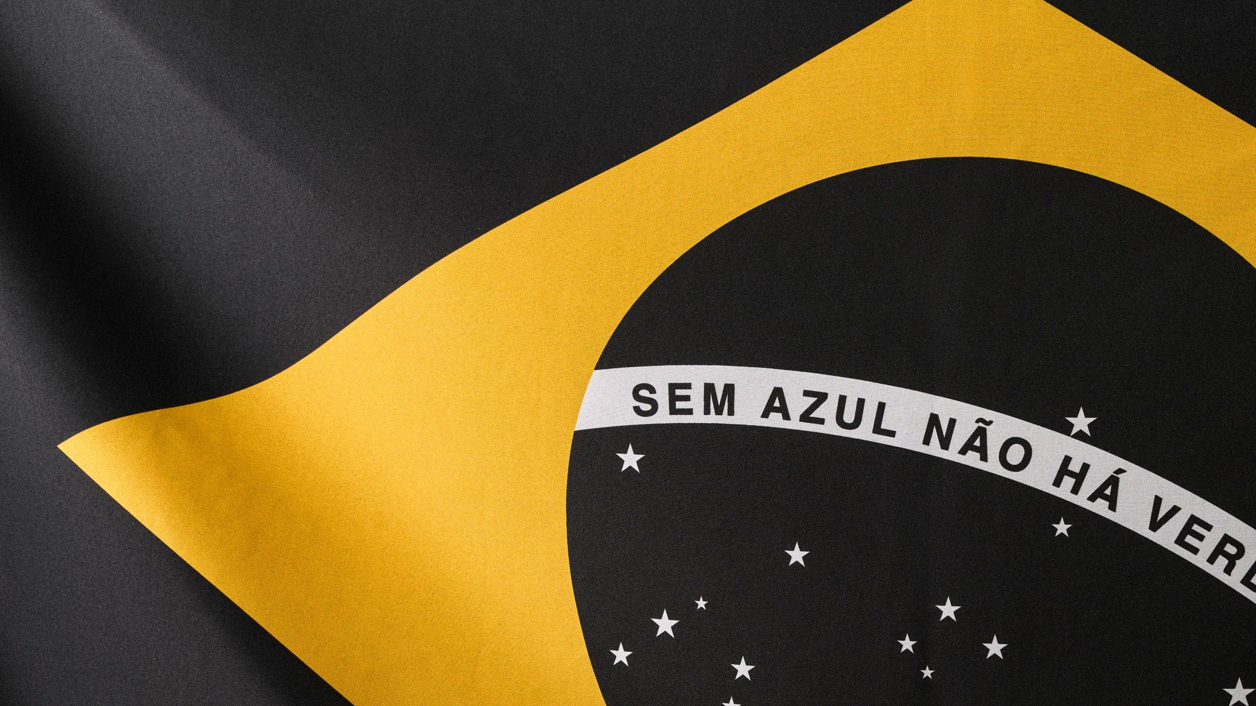
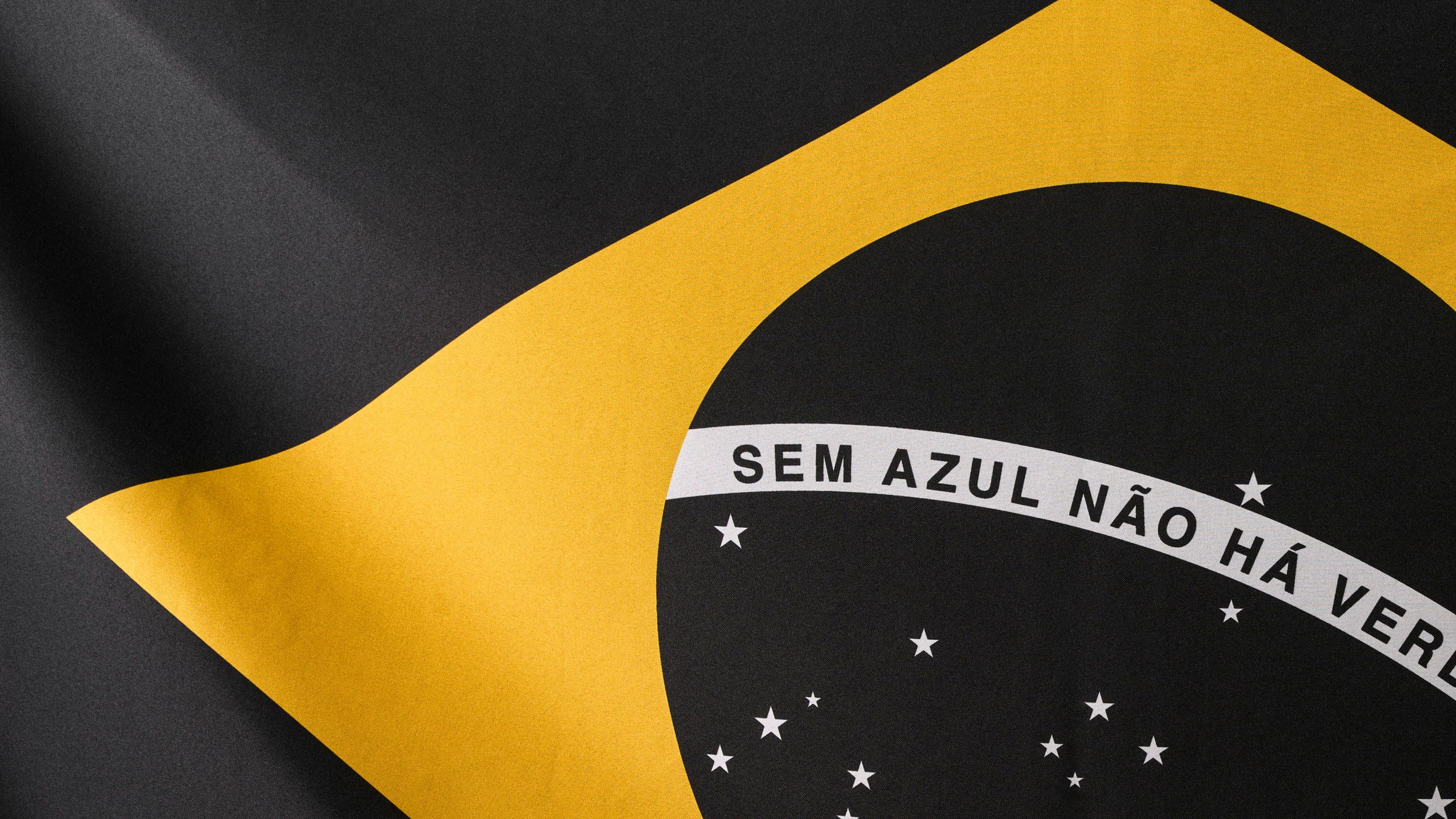
Launched during the COP30 meeting in Belém, the first phase of the campaign removed the blue and green from the Brazilian flag. This stark design was created for SOS Oceano, a coalition of NGOs advocating for the expansion of marine protected areas. The message was clear: without blue, there is no green. The oceans are essential for life on land, and their conservation is critical.
 (Image credit: Droga5 São Paulo)
Expanding the Message: Phase Two
In the second phase, Droga5 São Paulo collaborated with Black Madre Studio and Joules & Joules Laboratory to produce a series of six unique screen-printed artworks. These pieces use natural mineral pigments and draw on Brazilian naturalist iconography, pairing marine and land flora and fauna—from the Amazon Rainforest to the Humpback Whale. The yellow diamond of the flag remains a focal point, highlighting the fusion of colors removed earlier.
Diego Limberti, Chief Design Officer at Droga5 São Paulo, explains: "The beginning of this project showed that design can condense a complex environmental truth into a single, felt symbol. In this phase, the elements of the flag are reinterpreted to emphasize the animals that live in marine parks and their relationship with the forest. One biome depends on the other."
The Creative Process and Medium Choice
The campaign was developed alongside WALK, Droga5's impact innovation hub. Screen printing was selected for its chromatic rigor, layered ink application, and deep history in graphic arts, reinforcing the project's narrative. The use of natural pigments aligns with the environmental message, avoiding synthetic solvents. André Maciel, Creative Director at Black Madre Studio, notes: "The project is rooted in color theory. When we say 'without blue there is no green,' we're working with the fundamental logic of primary and secondary colors."
Why This Campaign Matters
This initiative demonstrates how design can be a tool for activism, transforming a national symbol into a call for ocean conservation. It stresses the interconnectedness of ecosystems and the urgent need to protect marine environments. By reimagining the Brazilian flag, Droga5 São Paulo has created a visually striking campaign that educates and inspires action.


Comments
Join Our Community
Sign up to share your thoughts, engage with others, and become part of our growing community.
No comments yet
Be the first to share your thoughts and start the conversation!