As a huge fan of Control, with its blend of stale office rooms punctuated by new weird abstraction and stark angular architecture, I was hesitant to play Control Resonant. But the game's appeal is the baseline that sits under everything in this sequel. Even though it pushes out of the Oldest House onto the more open streets of New York, and shifts into up-close Devil May Cry-inspired melee combat, it never stops feeling like Control.
“Control first, so that’s the world,” says art director Elmeri Raitanen. “It already rules out many things that it can’t be.”
This means every space, every asset, every bit of this New York works inside a strict visual language before it even becomes a level. While I’ve played many games set in New York, I’ve never seen it like this before.
Making the Familiar Weird
Resonant, like Control before it, is about spectacle within recognized spaces. The idea is that you understand the world to a point, then it breaks apart, twists, and becomes unusual. Here, that’s done through lighting, repeating patterns, and shifting shapes of creatures infesting New York. At times, everything gets 'weird': repeating figures spiral into the sky, the ground gives way, streets become caverns, avenues are canyons.
“We definitely want to aesthetically and creatively stand out,” says Raitanen. This shows in how aggressively consistent the visual language is, especially now that the game has shifted into faster, closer combat.
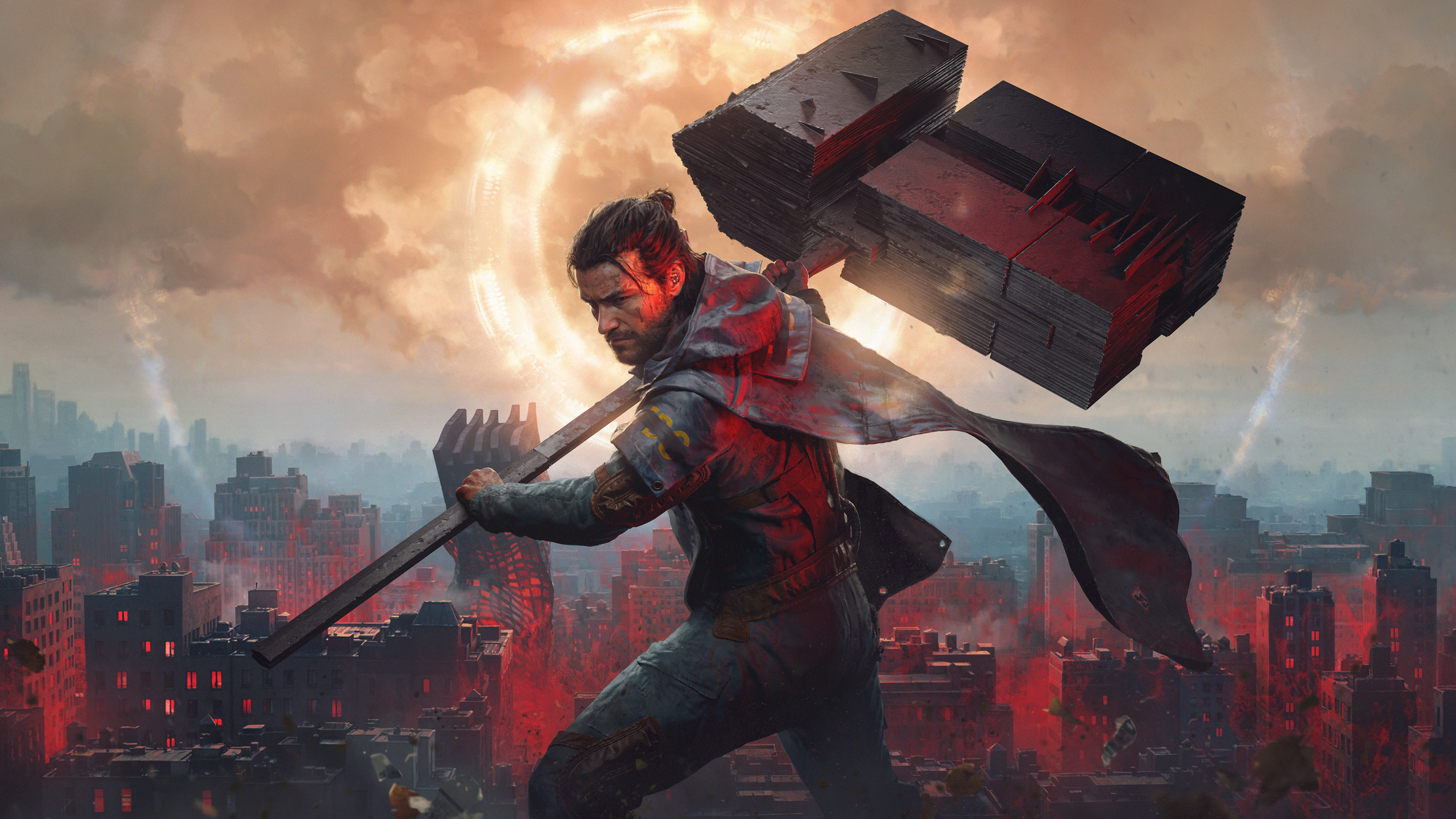
Because Resonant is not hanging back anymore. Protagonist Dylan Faden swings a shifting, vibrating metal weapon called the Aberrant that flips between forms—a scythe, hammer, dual daggers—layering in 'paranatural' abilities. It’s all very physical, very immediate, but it still reads cleanly, which is surprising given how much is happening at once.
That clarity comes from the way everything is visually signposted, even when the screen is full of motion. After 20 minutes, I instinctively know which enemies pose the biggest danger, how others will attack, and which could offer life-saving energy drops. There’s a designed hierarchy to enemy types, and despite the creature design being strangely flexing mixtures of diffused light and claws, it all just makes sense.
Red Is the Colour of Hiss
The colour red is here to help more than I first realized. It’s not just about mood or style; it’s communicating danger and places of interest. Red is the colour of the Hiss. This carries over from the first Control, and given the speed and intimacy of Resonant, it's become more important, especially when exploring the sandbox-like Evacuation Zone.
“The piercing red light is definitely one of them,” Raitanen explains about visual signals for the Hiss. In practice, it floods environments with a very specific warning tone; everything shifts when it appears, and areas of the map tease me from afar—a glowing red alleyway hints at a side-quest or story secret I can't ignore.
In the Evacuation Zone, the Hiss took over a bus—I had to fight a spinning bus. That red shows up everywhere, layered over a version of Manhattan that’s already dense and grounded but then broken up by heavy blocks of crimson and jagged black distortion from the Hiss, which feel like they're aggressively invading the world.
Patterns and Repetitions
This is where production reality starts to show through the art direction. “We are still a fairly small team, so it’s sort of artisanal video game making,” Raitanen says. There’s a lot of reuse going on, but it’s not hidden; instead it’s folded into the language of the world and made into a statement of how the Hiss is reshaping New York.
My first story mission, The Sinkhole, is a prime example of the team making a production limitation into a staple of the art direction. Control and Resonant are built on the idea of patterns, repeating motifs that evoke psychological unease. When I drop into the sinkhole, I’m confronted by a honeycomb of repeating rooms, all the same, dressed with the same wallpaper, tables, chairs, and humming TV. I can manipulate the rooms, spin them, flip them; ceilings are now floors. It’s the same asset used time again, and it’s brilliantly confusing.
“We don’t have to build like 100 different apartments,” Raitanen says. I start noticing how windows repeat, how layouts echo each other, but it works because there’s intentional confusion behind the environment design that builds on deeper patterning throughout the game.
Then there’s this line that really explains the intent: “We have the same exact house asset, repeated, and it actually becomes a string rather than something that stands out as a visual bug.”
Playing Resonant, repetition starts to feel like a rhythm running through the whole game, whether it's rows of jittering pigeons caught in a loop or moments when shocks of FMV—filmed footage of patterns forming in water, ink in liquid—are superimposed over the action. So even when you catch repeated assets, it doesn’t break the illusion, because it’s consistent; it belongs to the rules of the world, and it means something.
I ask Raitanen to describe the look and art style of Control as a series. “How do you visualise uncertainty?” he says, explaining the art team were asked to design ‘uncertainty’. The script asked them to create “an object in a constant state of superposition” or a “seven-dimensional object”. It sounds like theoretical physics, not art and design, but in practice those ideas translate into spaces that don’t quite settle but remain playable.
Back in the Sinkhole, everything comes together. Repetition and room spinning is confusing, but then I remember the colour red and its meaning, and notice a room will light red every time a Hiss enters or passes. It all comes together—in an engaging blend of chaos, randomness, repeating design and colour-coded art direction to make it all readable.
By the end of my Resonant demo, what sticks isn’t the scale of New York or the fast-paced combat; it’s how deliberate everything feels in its use of repetition as design. Control as a series is built on the identity of patterns, unsettling repeating forms and looping 'lines' of surrealist spaces. The fact that Remedy has managed to transition the series from a shooter to a brawler, from the Oldest House to the streets of Manhattan, and retain its core new-weird identity really is an art form in its own right.

Comments
Join Our Community
Sign up to share your thoughts, engage with others, and become part of our growing community.
No comments yet
Be the first to share your thoughts and start the conversation!