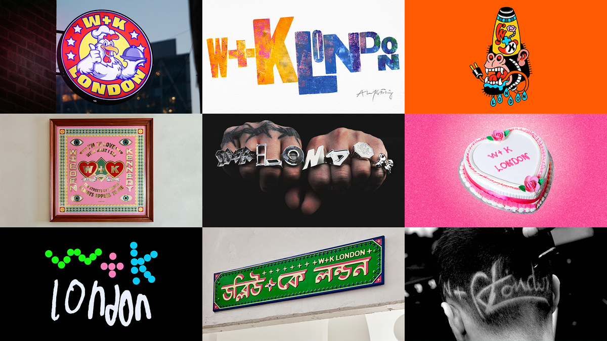
A New Take on Branding
A logo is often perceived as a constant—a steadfast representation of a brand's identity. However, for a creative agency like Wieden+Kennedy, embracing diversity in their branding makes perfect sense. Instead of a single logo, they are experimenting with multiple logos that evolve continuously to reflect their eclectic influences and talents.
The Creative Process
Wieden+Kennedy London has engaged nine local artists and makers to reinterpret their logo. This initiative showcases a variety of mediums and aesthetics, from jewelry to culinary art, emphasizing the agency's commitment to creativity and innovation. The project is designed to be ever-changing, providing fresh perspectives on the agency's identity.
 (Image credit: Wieden+Kennedy London)
Featured Collaborations
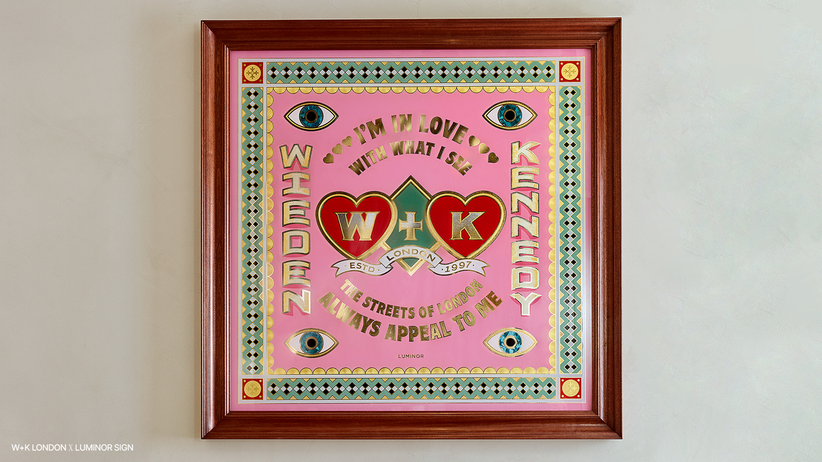
- Luminor Sign created a stunning 1m x 1m framed gold leaf glass panel for a meeting room.
- Joe Bazalgette Zanetti crafted rings that spell out the agency's name across the wearer's knuckles.
 (Image credit: Wieden+Kennedy London)
This dynamic approach not only showcases the creativity of the artists involved but also positions Wieden+Kennedy as a forward-thinking agency that values artistic expression as a core aspect of its brand identity.


Comments
Join Our Community
Sign up to share your thoughts, engage with others, and become part of our growing community.
No comments yet
Be the first to share your thoughts and start the conversation!