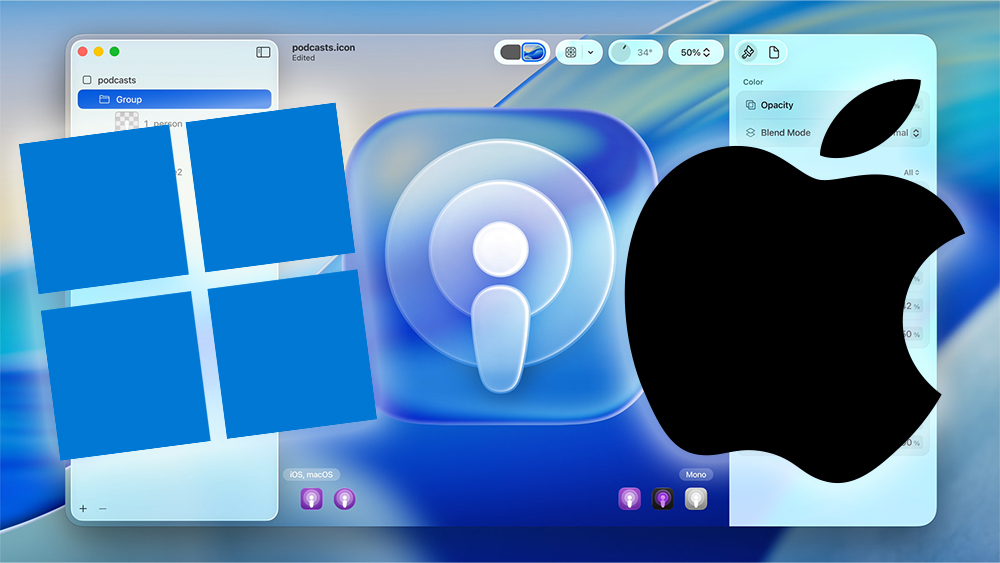
Microsoft's Take on Apple's Liquid Glass UI Sparks Debate
Apple recently unveiled its Liquid Glass UI design for iOS 26, iPadOS 26, and MacOS Tahoe 26 at the Apple WWDC 2025 event, describing it as "delightful", "elegant", and "modern". However, the design has drawn comparisons to much older software, with some calling it retro.
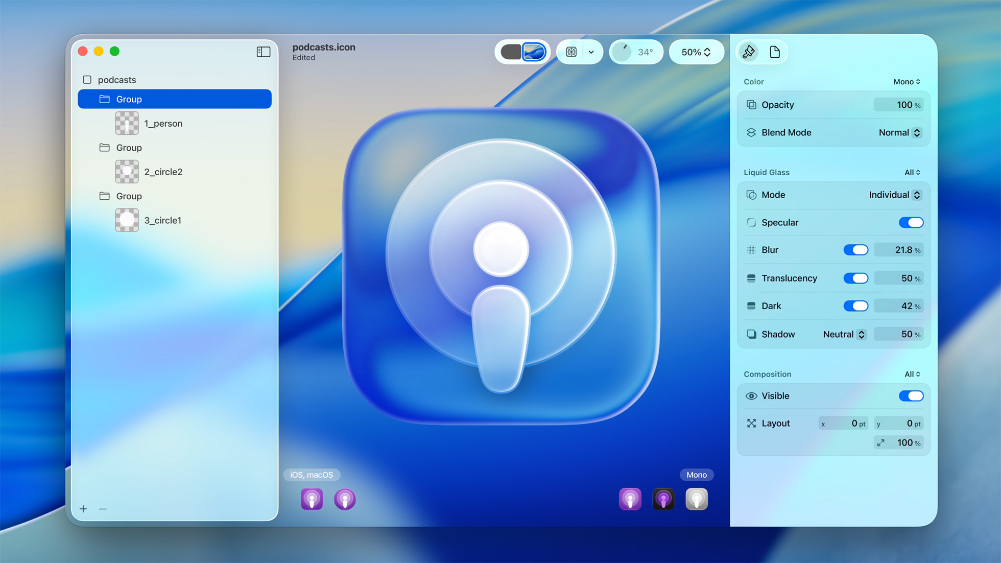 (Image credit: Apple)
The Controversy
- Microsoft suggested that Apple's design might have been inspired by Windows Vista, sharing a TikTok video mocking the similarities.
- Designers are also debating the corner radiuses in MacOS Tahoe 26, with some calling it a step back in design.
- The transparent elements in Apple's new UI have been compared to pre-iPhone era software, raising questions about innovation.
The Bigger Picture
While Apple cites VisionOS as the main inspiration for the Liquid Glass UI, the backlash highlights the fine line between innovation and nostalgia in design. Whether Microsoft's jab is justified or a case of the pot calling the kettle black remains to be seen.
Daily design news, reviews, how-tos and more, as picked by the editors.


Comments
Join Our Community
Sign up to share your thoughts, engage with others, and become part of our growing community.
No comments yet
Be the first to share your thoughts and start the conversation!