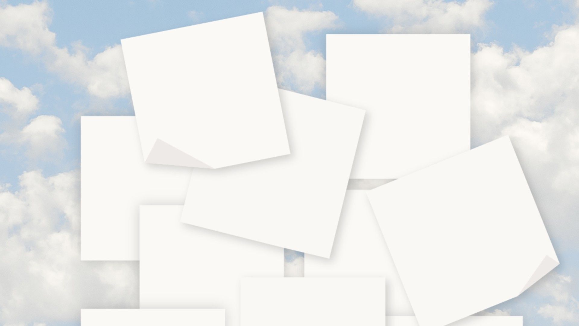
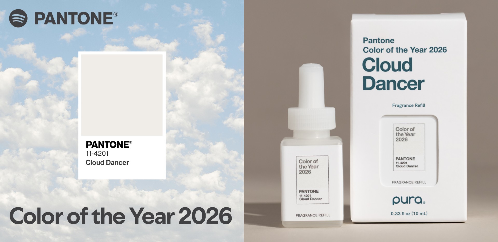
There's a certain audacity to announcing your 2026 Colour of the Year is white. Not cream, not ivory, not even that trendy greige that's been haunting Pinterest. Just white. Okay, 'Cloud Dancer' if you're being fancy, but let's not pretend a dreamy name makes it any less... white.
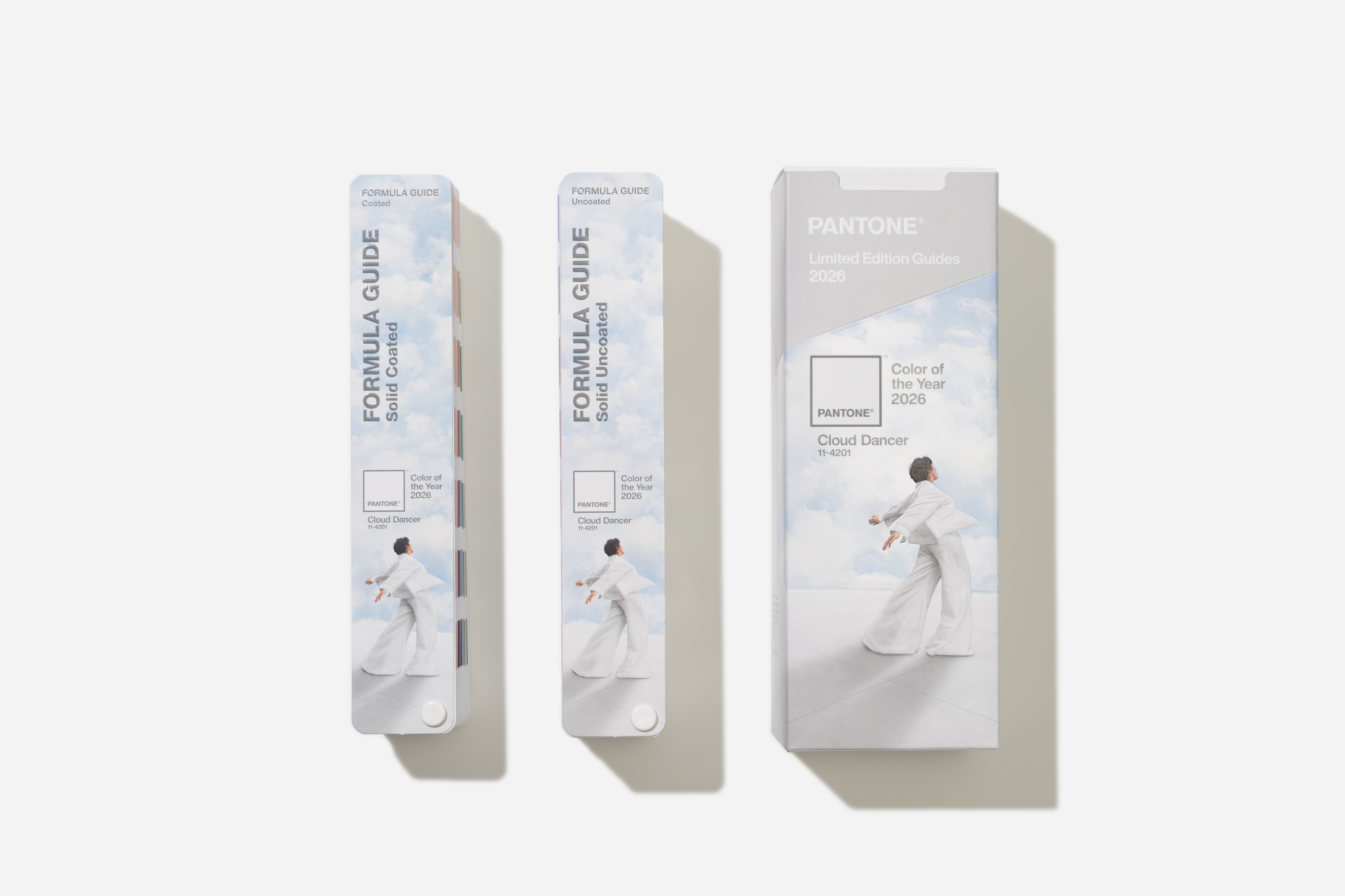
Yes, Pantone has finally done it; they've chosen the colour of a blank page. PANTONE 11-4201 Cloud Dancer is, according to their press release, "a billowy, balanced white imbued with a feeling of serenity" with an "aerated presence" that whispers "calm and peace in a noisy world". Hmmm. Or, you know, they could have just said: "We chose white".

These choices matter because Pantone is the colour standardisation company. When they crown a colour, brands listen. Fashion designers scramble. Paint companies rush out matching tins. So when Pantone picks white, it's not just a colour choice. It's a statement about where we are as a culture.
And apparently, where we are is exhausted, overstimulated and desperate for someone to turn down the volume on everything.
A fresh start?
Leatrice Eiseman, executive director of the Pantone Colour Institute, explains that white... cough sorry, Cloud Dancer represents "our desire for a fresh start" and provides "release from the distraction of external influences." Translation: we're all knackered, the world is terrifying, and maybe staring at some nice white space will help us think straight.
It's hard to argue with the diagnosis – it feels like perfect colour theory. The past couple of years have been, to put it mildly, a lot. War, political chaos, economic uncertainty, AI anxiety and a creative industry that's been through the wringer. A structural white that doesn't demand anything does have a certain appeal.
In a year when every brand has been screaming for attention, when AI-generated imagery has flooded our feeds, when the sheer volume of visual noise has become unbearable, perhaps the most radical choice is to choose... well, nothing at all. Kinda.
So is this a genuine insight into our cultural moment, or just a convenient way of getting people like me to write articles about Pantone? Well, it's probably a bit of both. And I don't honestly have a problem with that.
Pantone's choices have always been part zeitgeist-reading, part self-fulfilling prophecy. And it's undeniable that we're living through a transitional moment.
The creative industry is being reshaped by AI, economic pressures and shifting client expectations. Maybe a year of white is exactly what we need to strip back the noise and remember why we got into this business in the first place.
Or maybe Pantone just ran out of actual colours and figured they'd give minimalism another go. Either way, prepare for 2026 to be very, very beige. Well, white. Cloud Dancer white, if you want to be precise.

Comments
Join Our Community
Sign up to share your thoughts, engage with others, and become part of our growing community.
No comments yet
Be the first to share your thoughts and start the conversation!