A Controversial Design Trend
One logo design trend that's caused a bit of controversy in recent years has been taking minimalism to extremes with the elision of parts of letter forms. We previously discussed designs like the KIA logo and the Nokia logo, which faced significant backlash.
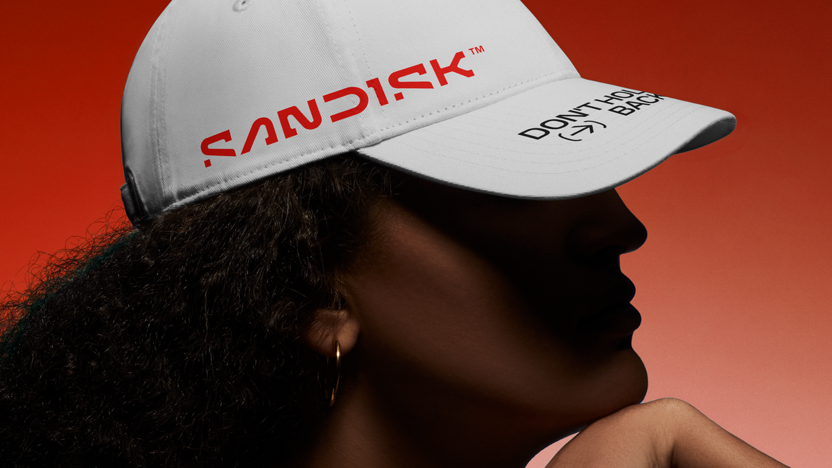
Sandisk's New Logo Reveal
Following this trend, the new logo for Sandisk has been unveiled, and comparisons to previous minimalist designs are likely to arise. Sandisk, known for their top-tier external hard drives, has opted for a more minimalist rebranding that features a clever inspiration, resulting in a dynamic animated logo.
 (Image credit: Sandisk Corporation)
Conclusion
In the context of recent design trends, Sandisk's logo reflects a shift towards minimalism while incorporating a unique spin, making it a noteworthy addition to the ongoing conversation about logo design in the digital age.


Comments
Join Our Community
Sign up to share your thoughts, engage with others, and become part of our growing community.
No comments yet
Be the first to share your thoughts and start the conversation!