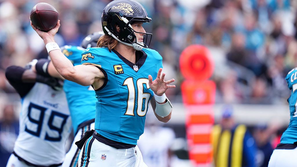
New sports logos always cause a stir, but the leaked Tennessee Titans logo has ignited a fierce debate among NFL fans. Some are aghast at the new minimalist design, calling it boring and uninspired, while others praise its sleekness, creating a heated online discussion.
 (Image credit: Rich Storry via Getty Images)
The leaked design replaces navy blue with light blue and removes the iconic flames, a staple since the 1990s inspired by the Greek Titan Prometheus. One fan exclaimed, "If this is truly the new Titans logo, it immediately becomes one of the worst in the NFL—a complete downgrade that continues the terrible trend of minimalism in sports."
Others disagree, with one stating, "I guarantee everyone will eventually like this. This is the exact right amount of simple, like the Steelers, and will look much better on gear." Some fans speculate about the team's brand identity, noting its evolution from the Tennessee Oilers to the Titans, suggesting a desire to move away from the past while retaining some connection.
Skepticism also abounds, with one fan comparing it to the Cracker Barrel controversy, doubting its legitimacy unless changed due to public outcry. While official mockups on uniforms are scarce, fans have overlaid the new logo onto current gear to envision its look.
The creative team has played it safe with this redesign, embracing minimalist aesthetics but potentially stripping away heritage by removing the fire symbol. It's a clean and sleek design overall, but the reaction highlights the challenges of logo redesigns in sports branding.
For less controversial logos, check out our picks for the best NFL logos and explore the history of the NFL logo itself.


Comments
Join Our Community
Sign up to share your thoughts, engage with others, and become part of our growing community.
No comments yet
Be the first to share your thoughts and start the conversation!