Walmart is known for many things, but impulsiveness isn’t one of them. The company carefully considers any major changes, a strategy that has proven successful for the largest retailer in the U.S.
Walmart’s Cautious Approach to Change
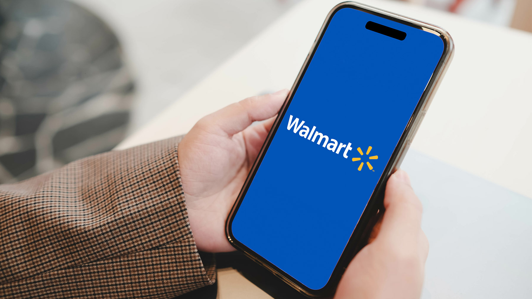
Walmart’s first logo update in nearly 17 years involves subtle tweaks that may go unnoticed by casual observers. The changes include slightly thicker lettering for "Walmart" and a more prominent yellow spark symbol in its branding. The goal of this update is not to completely reinvent the logo but to modernize it in line with Walmart's increasing focus on e-commerce and digital services.
William White, Walmart U.S.’s chief marketing officer, stated, “This isn’t a rebrand; it’s more of a refresh to represent who we are today.” The last significant update occurred in 2008, where the hyphen was dropped from its name, transitioning from “Wal-Mart” to “Walmart.”
Small Tweaks, Big Impact
The updated logo features a deeper shade of blue in the background, brighter yellow in the spark, and bolder Walmart lettering. While these adjustments may not cause a passerby to do a double take, they introduce a subtle freshness to the logo. White explained that the updates bring more vibrancy and energy to the spark, enhancing its depth.
A New Look Beyond the Logo
Walmart is also enhancing its overall image beyond the logo. The retailer has improved its fashion offerings, employing visual merchandisers to display outfits on mannequins rather than simply stacking clothes with price tags. This shift, along with a focus on organic food options, has attracted more affluent customers, contributing to a 5.3% increase in comparable sales last quarter.
White emphasized the challenge of appealing to tech-savvy shoppers while maintaining loyalty among traditional customers. Walmart is gradually reshaping its image, relying more on its yellow spark in advertisements and sometimes omitting the word “Walmart” altogether. This strategy aims to encourage consumers to see Walmart as more than just a low-cost retailer, reshaping public perception and potentially attracting new shoppers from competitors like Costco.


Comments
Join Our Community
Sign up to share your thoughts, engage with others, and become part of our growing community.
No comments yet
Be the first to share your thoughts and start the conversation!