YouTube's Color Evolution
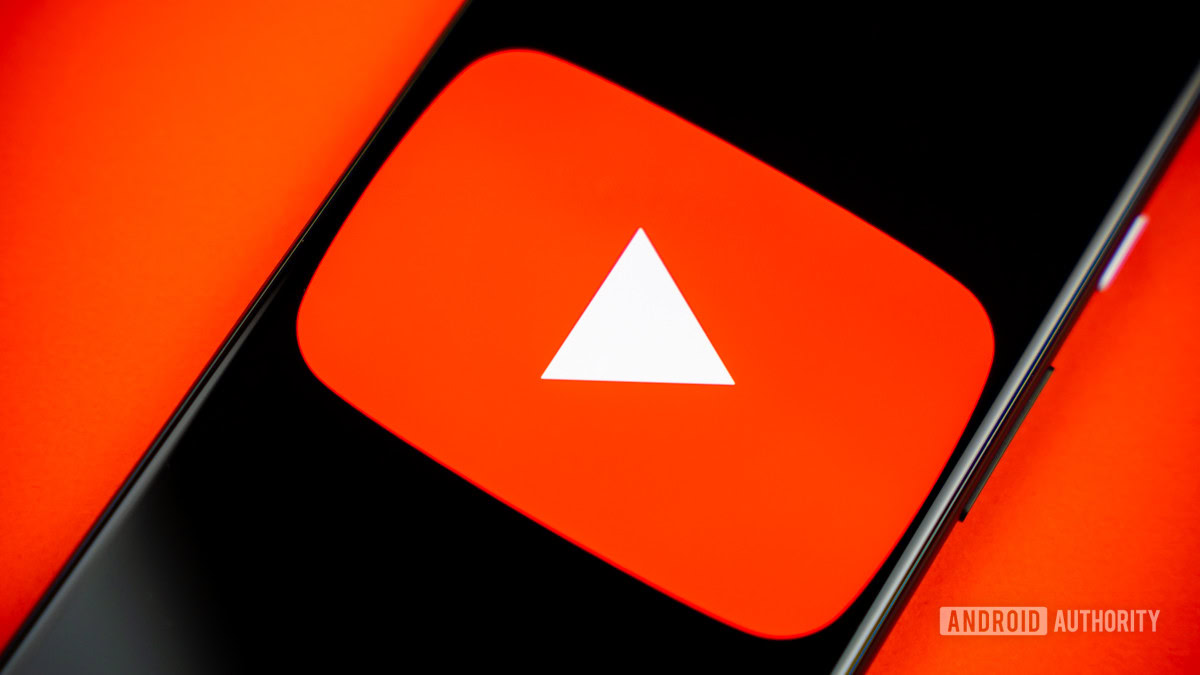
If you’ve noticed something a little different about YouTube lately, you’re not alone. The platform has quietly updated its signature red to a cooler shade and introduced a red-to-magenta gradient in key elements like the progress bar.
The Reason Behind the Change
The change was subtle, but YouTube’s design team took it very seriously. In a deep dive into the decision-making process, they explained how this seemingly minor color adjustment was the result of extensive research, accessibility considerations, and technical factors.
Addressing Previous Issues
The previous red, introduced in 2017, had some unexpected issues:
- It looked too intense in key UI moments.
- Sometimes appeared orange on certain screens.
- Contributed to screen burn-in on TVs.
By shifting to a slightly cooler red, YouTube aimed to create a more balanced and approachable look while resolving these technical problems. “We wanted an evolution, not a revolution,” said Robyn Lee, one of YouTube’s visual design leads.
Introducing the Gradient
Beyond tweaking the red itself, YouTube also added a red-to-magenta gradient across the platform. According to Robyn Lee, magenta represents “imagination and evolution” and was chosen to bring a fresh but cohesive look to YouTube’s branding. This change not only enhances the aesthetic but also adds more depth and movement, making the interface feel more dynamic.
Accessibility Considerations
Accessibility played a significant role in refining the colors. Different shades of red and magenta were tested, ensuring that motion elements adapt to various devices to prevent user performance issues or visual discomfort.
![]()

Comments
Join Our Community
Sign up to share your thoughts, engage with others, and become part of our growing community.
No comments yet
Be the first to share your thoughts and start the conversation!