Empathy is an underrated superpower in the professional world. You don’t just need regular intelligence to be a good designer—emotional intelligence can raise the quality of your work, too. And that means putting yourself in the client, consumer, or user’s shoes and understanding their wants and needs.
Not everyone can set their ego aside and think about others, including product, graphic, interior, and other designers. Our team has collected some of the most mind-blowingly awful and hilarious designs that hurt to look at and make you wonder how nobody spotted the incoming failures before production started.
What Makes a Design Fail?
Design icon Dieter Rams has 10 principles of good design that are relevant to all professionals to this day. For him, good design is innovative, makes a product useful, aesthetic, makes a product understandable, unobtrusive, honest, long-lasting, thorough to the last detail, environmentally friendly, and has as little design as possible.
No matter if you’re designing a poster, building, tech product, or piece of furniture, you can avoid plenty of mistakes if you at least keep these principles in mind. Ideally, what you should be aiming for is a healthy balance between function and form, without obsessing over either one too much.
Function without form ignores humanity’s need for beauty and eye-pleasing details. What’s more, you need more than function to sell products, and visually appealing designs get sales.
Form without function leads to aesthetic yet uncomfortable products that are mainly there to look artsy without much substance. In both of these cases, the designer fundamentally misinterprets their clients’ needs.
The Anatomy of Bad Design
Poorly-designed products often hide their main function through unnecessary, convoluted features. They are not intuitive, nor are they self-explanatory. So, they push consumers away. What’s more, bad designs are also distracting, difficult to use, forgettable, and short-lived.
There are many reasons why these mistakes happen in a design setting, but mainly, it usually involves a lack of feedback, for example, from the designer’s peers, superiors, clients, focus groups, family, friends, etc. The more constructive criticism you can get, the better the product… so long as you don’t let go of your vision to try to appeal to everyone all at once.
Setting your tastes and personal preferences aside, not all design decisions are equal. Some are objectively better than others because they take the wants and needs of the end users into account. In other words, good design is empathetic and consumer-friendly. Bad design, on the other hand, is solely driven by the creator’s ego and lacks self-awareness and foresight.
Learning from Failure
Of course, every professional makes mistakes. That’s how we all learn, improve, and grow. However, how you respond to failures says a ton about your work ethic, character, and priorities. Being criticized and getting rejected is unpleasant, but it is an unavoidable part of life.
There is a world of difference between having a growth mindset and a fixed mindset. And it can make all the difference for any professional’s career, whether they’re in design or not.
Someone with a growth mindset fundamentally believes that they have the capacity to learn and improve. For example, a designer with a growth mindset, who makes low-quality designs and gets feedback from their supervisor, accepts what they’re being told and knows that they can meaningfully develop their skills.
Fixed mindset individuals tend to focus mainly on the restrictive and negative aspects of their life experience. Their self-esteem is very limited, so they question their ability to learn anything new. What’s more, they are convinced that everyone else gets better results and that they don’t struggle as much.
In a design context, having a fixed mindset might involve a young professional giving up because their first few ideas or prototypes didn’t land. Instead of embracing the (hopefully constructive) criticism they received and focusing on polishing their skills, they give up or feel envious of their other, more successful colleagues.
On the flip side, a growth mindset-oriented design professional would see their failure as an opportunity to hone their skills, become more aware of their blind spots, and create something better. Putting out an awful, hilariously designed product or poster can be the springboard toward something better. Having a good sense of humor and laughing at your own mistakes can take some of the sting from failure, too!
Examples of Epic Design Fails
Here are some of the most cringe-worthy and laughable design fails that made us question how they ever got approved:
- An ATM keypad with the ENTER button in the CLEAR position and vice versa.
- A public restroom with a mirrored ceiling reflecting the toilets.
- A bus ad showing a baby photoshopped as a Borg with the text "We Are The Borg. Resistance Is Futile."
- A fire extinguisher sign depicting a fire extinguisher actively spraying fire.
- A solar-powered parking meter in an underground garage.
- A Health Club sign where the word 'HEALTH' has weights forming the first H but not the second.
- A restaurant sign for "JESSICA'S Family" with a vertical "EAT" sign above, creating an unfortunate reading.
- A package opener in a hard-to-open plastic package, defeating its own purpose.
- A sign for a Christmas Bazaar and Craft Show that reads "Fight Children with Diabetes Fundraiser."
- A bus advertisement with a woman doing exercises, but her chest aligns with the wheels.
- A maze game where the car can bypass the entire maze to reach the house.
- A banner that says "YOU ARE ALONE" held by people in front of a building.
- Two tubes of threadlocker, one blue labeled Red and one red labeled Blue.
- A magazine cover with a model whose leg is obscured by a large red dress.
- A triangular warning sign with a stick figure falling up stairs.
- A pie chart sign showing a university budget, misrepresenting fractions.
- An advertisement for 'Fagas Straps' with an unfortunate URL.
- An advertisement banner that reads "COULD NOT CONNECT TO TRANSLATOR SERVICE."
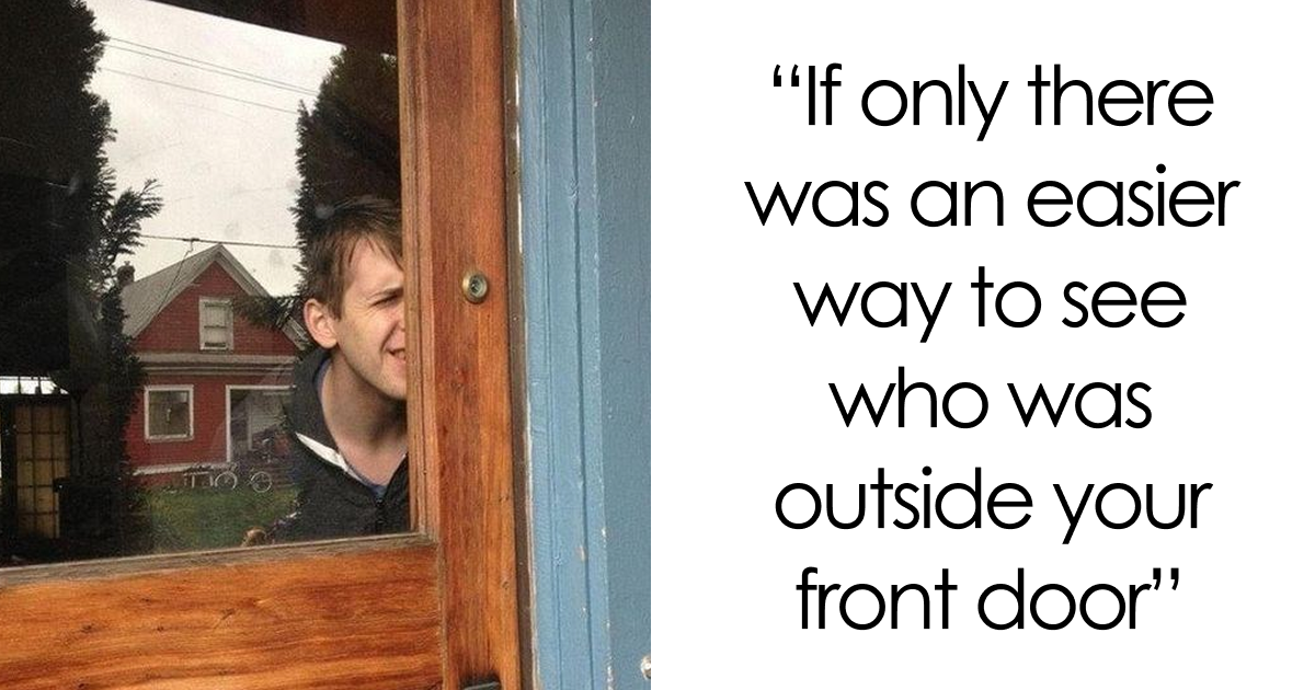
- A man peeking through a wooden door because there's no peephole.
- A store shelf with power accessories mislabeled.
- A postcard for a design school with jumbled, unreadable text.
- A yellow playground slide with three separate chutes that could cause injury.
- A banner with a confusing logo that spells "COOL JAZZ" association.
- Food packaging that says 'Ideal for sharing' but also 'Serves 1'.
- A store sign that reads "We're Not Happy 'til You're Not Happy."
- A card with misaligned text: "If you car would you know what accident to do?"
- A banner that reads "NOW HIRING NOW RIGHT NOW WE'RE HIRING NOW."
- A basketball game poster with the words "Non Action and Stop Excitement."
- Two syrup bottles, one labeled "OH! BOY" and the other "OH! BOY SYRUP."
- A building with the sign "NDEESIGIHGBNOCREHNOTOEDR."
- A wrist watch with numbers 1, 3, 4, 5, 9, 11 visible, making it hard to read.
- A sign that says "SELL YOUR HOUSE FAST! CALL RIGHT NOW!"
- A children's slide emerging from the rear of a large elephant statue.
- A printing shop window with backward text.
- A maze with a direct path from start to finish.
- Kitten socks with the kitten's face distorted when worn.
- A Heinz ketchup packet with repetitive translations.
- An Ohio State Buckeyes scoreboard clock where the visitor team is always winning.
- A yellow pillow showing an Eiffel Tower as the A in "Aaris" instead of Paris.
- An outdoor billboard advertising glasses with an unflattering image.
- A burger menu with large text "HEALTHY BURGERS" looking like "HEAL THY BURGERS."
- A coaster with a hangman game for the word ALCOHOL, missing an O.
- Two cans of Turbo Radiator Coolant resembling energy drinks.
- Two urinals placed extremely close together.
- An Apple Magic Mouse being charged from underneath, making it unusable.
- A Super Store sign mimicking 7-Eleven, named 9-Eleven.
- A clock where the number 8 is noticeably smaller.
- A Halloween decoration where window frame placement makes "TRICK OR TREAT" read as "F***K OR TREAT."
- A microwave oven control panel with many complex symbols.
- A poorly formatted sign for a "cAncer tReatmenT institute ...heals..."
- A banner with an incomprehensible military support acronym.
- Levi's boots with a fake zipper causing holes.
- A sign stating "Toilet ONLY for Disabled, Elderly, Pregnant, Children."
- A bus ad that says "Take Action, Take Control, Quit SCHOOL. Smoking not our future."
- A wooden sign that reads "I teach what's your superpower" missing punctuation.
- Window decorations misspelling "LE T**S NOW."
- Novelty glasses shaped like 2017 with an exclamation mark, appearing as 20170.
- A remote control with an illogical button layout.
- A traffic jam at a toll plaza where 50 lanes merge into 4.
- A red sign in a dessert shop window with confusing text about STRESSED.
- A coat rack with five hooks under numbers 1-5, but number 5 has no hook.
- A newly built house with a blocked driveway due to poles and a cone.
- A playground slide with no side rails.
- An electrical outlet placed high on a wall behind a glass railing.
- A car gear shifter with a confusing rotary dial.
- Car speakers placed by the foot pedals, prone to being kicked.
Feel free to share your thoughts in the comments after you’ve finished laughing and cringing. Which of these designs did you enjoy hating the most, and why? Meanwhile, were there any designs that we’ve featured here that you actually think are semi-decent? What are the very worst product, graphic, and interior design decisions that you’ve spotted this week? Tell us all about it!

Comments
Join Our Community
Sign up to share your thoughts, engage with others, and become part of our growing community.
No comments yet
Be the first to share your thoughts and start the conversation!