I can’t remember the first time I saw a Drew Struzan poster, but I remember the feeling it gave me. His work went straight for the gut. Before I’d seen a single frame of the movie, before I knew anything about the plot or characters, I was already hooked.
The legendary artist and designer died this week at 78, after several years battling Alzheimer’s. Tributes have poured in from Steven Spielberg, George Lucas, Guillermo del Toro and countless other film-makers. And for those of us who grew up in the 1980s and 1990s, his passing feels personal.
The Art of Anticipation
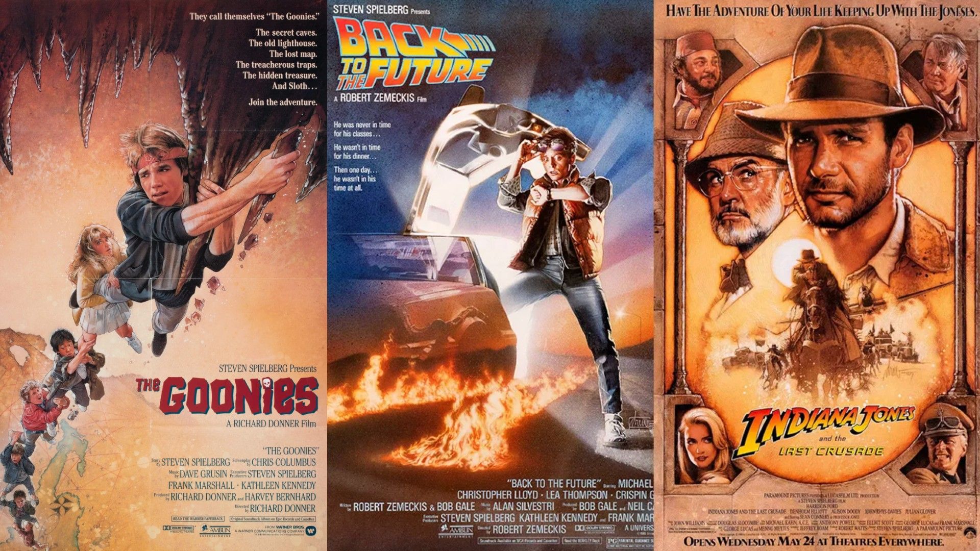
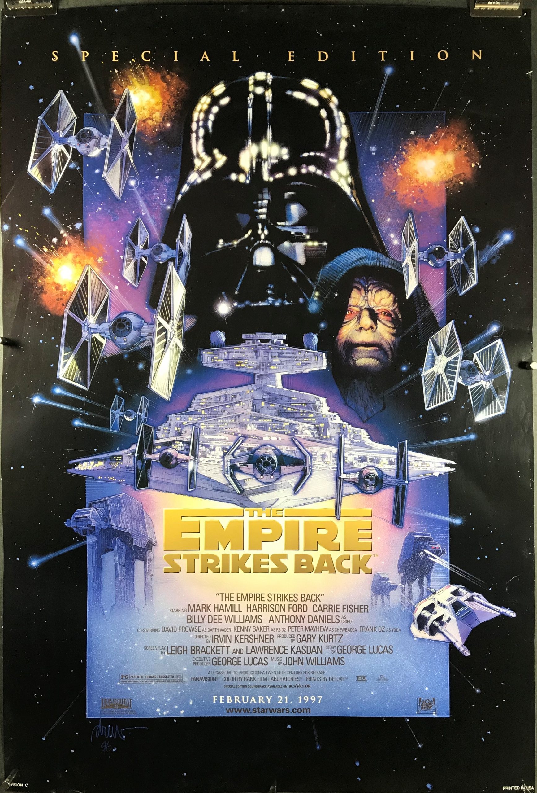
At first glance, Drew's posters look realistic, almost photographic. But look again. The light gives them away; that soft glow around Harrison Ford’s fedora in The Last Crusade, or the angelic rays of light behind Michael J Fox in Back to the Future. It’s not normal light; it’s the glow of promise, of something extraordinary just about to happen.
I miss that, intensely. Too often, modern movie posters are functional but empty Photoshop collages. They convey what type of movie it is, and which particular actors are in it… but that's about all. (Check out the worst movie posters of 2024 and you'll see what I mean).
Drew, in contrast, understood that a poster isn’t just an ad. It’s the overture; the moment before the curtain rises. His posters didn’t tell you what the film was about; they told you how it would feel.
The story of how Drew developed his style tells you all you need to know about the man. As a penniless art student in Los Angeles, he couldn't afford to waste paint. So he learned to spread it thin, mixing oils with unusual transparency, building up layers gradually. Poverty taught him restraint, and restraint became elegance.
For six years Drew attended Art Center College of Design, frequently getting kicked out for non-payment and sneaking back in through the back door. He sold homework paintings to other students just to keep going. Some weeks he ate only twice, when visiting his girlfriend Dylan. The rest of the time, he spent his meal money on supplies.
I don't want to romanticise this kind of existence; it's brutal. But it points to something we've lost in our risk-averse culture: the willingness to commit absolutely. Drew didn't have a backup plan because he couldn't afford one. The work had to succeed; there was nothing else.
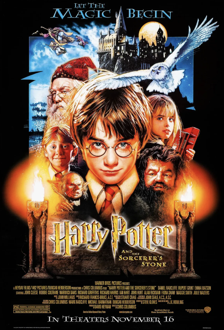
Fast-forward to the time when his “mountain of people” movie posters—layered, glowing faces stacked into a pyramid—solved a problem that still defeats many designers: how to show a large cast without creating chaos. Drew used hierarchy and atmosphere instead of flat equality. The key figures glowed; the supporting ones receded into shadow. Your eye knew exactly where to land.
Replaced by Safe
For me, Drew's art was a key element in what now seems like a golden age of blockbuster movies. And maybe I'm just becoming an old grump, but it feels like nowadays, that passion, craft and attention to detail is fading.
Walk past a cinema today and you’ll see what’s replaced it: rows of celebrity faces, teal-and-orange colour grading, fonts designed by committee. Everything safe, everything forgettable.
It's easy to blame technology for that: digital software makes endless revisions easy, and AI is increasingly reducing even that workload. But as the old saying goes, "A bad worker blames their tools". We’ve forgotten that creative work involves risk. That style matters. And that a good poster doesn’t just show you who’s in the film; it tells you why you should care.
Drew wasn’t working from a set of data points, optimising for demographics or responding to the demands of agents to "make the actor bigger". He wanted you to feel something. Everything else followed from that. He will be missed.


Comments
Join Our Community
Sign up to share your thoughts, engage with others, and become part of our growing community.
No comments yet
Be the first to share your thoughts and start the conversation!