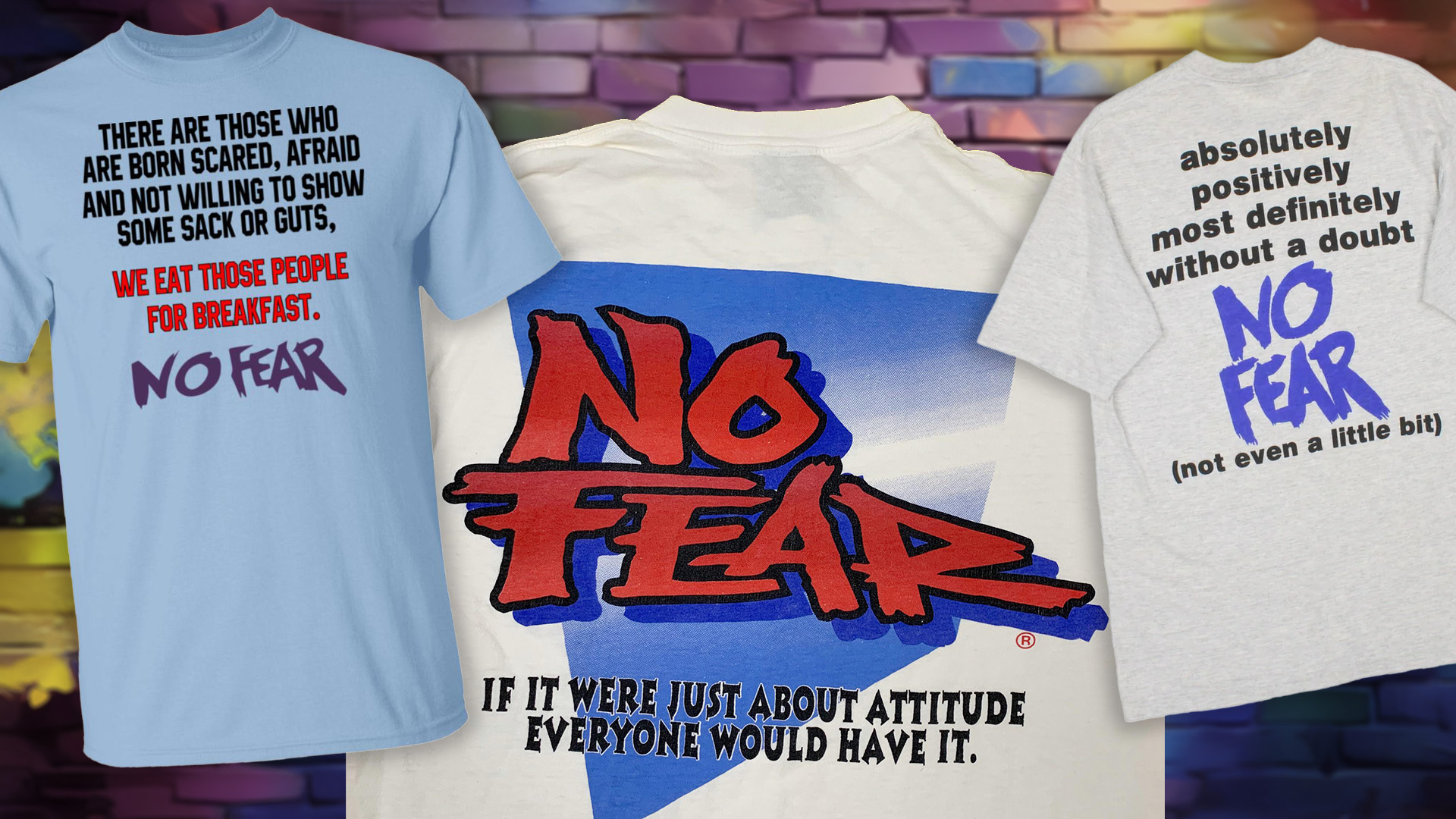
Clothing brand No Fear was once an icon of 90s/Y2K youth culture, tapping into the radical era of JNCO jeans and extreme sports. An underdog amongst the best logos of the 2000s, its teen angst-riddled apparel won the hearts of millennial counter-culturalists. Eventually, as Gen Z usurped the trends, No Fear soon lost its edge, falling into the cheugy trend graveyard.
But hold your mourning—No Fear is back. With a fresh offshoot, NO FEAR SPORT is a minimalist Gen Z-ified evolution of the brand's rebellious heritage. Clean cut and palatable, it's perfectly built for a modern audience, yet many miss its edgy (albeit dated) attitude.
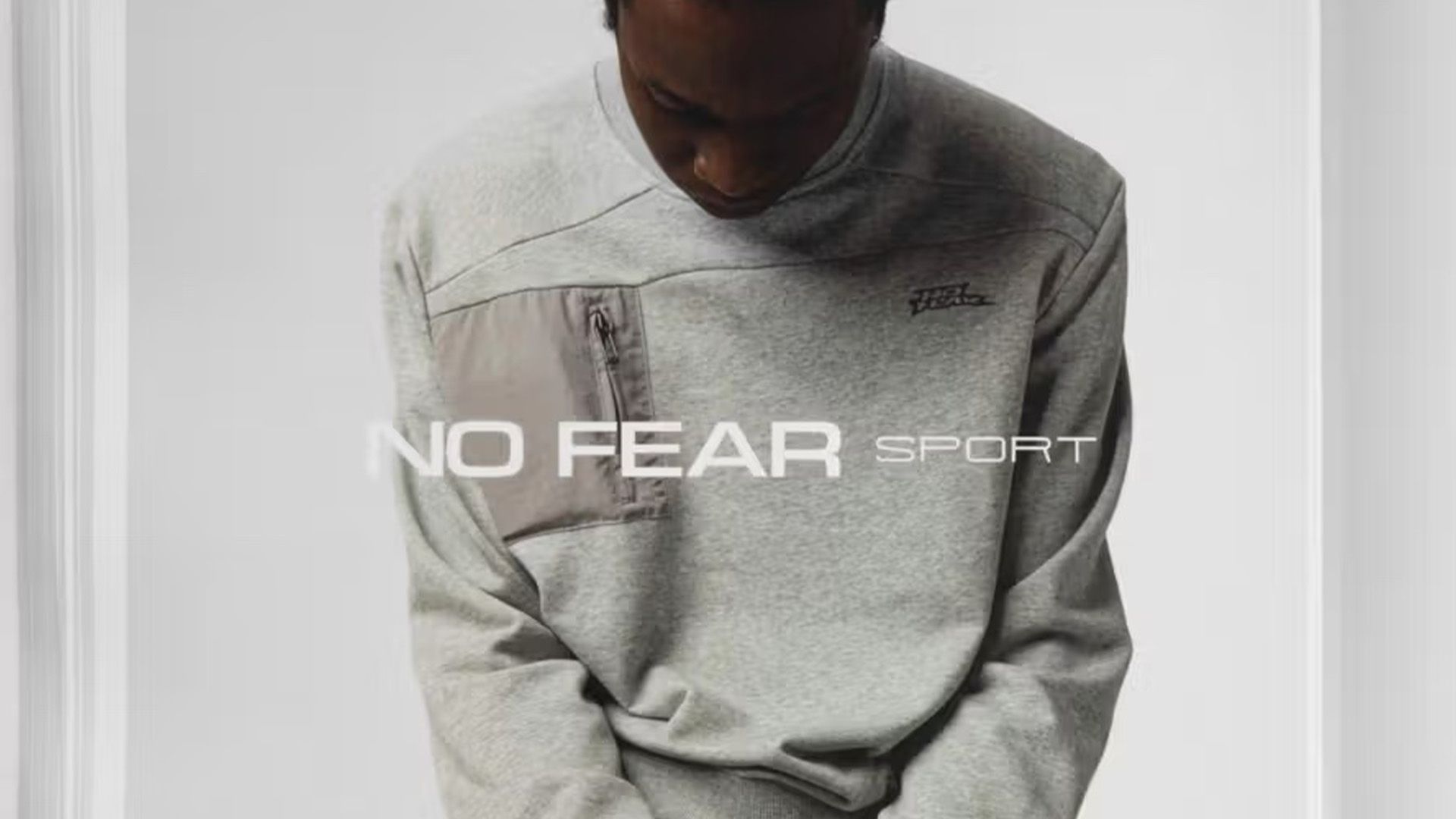
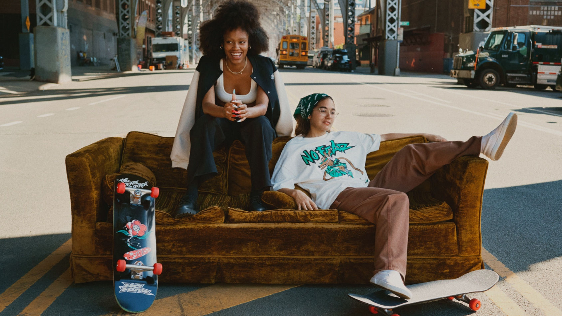
Defined by a line of "focused core basics", the new NO FEAR SPORT collection is awash with neutral palettes and understated logo pieces that capture little of its former glory. What used to be the brand embodiment of Jesse Pinkman and a flaming skeleton riding a motorcycle now carries mere whispers of its past identity, embellishing plain clothing pieces with its signature graffiti-style wordmark.
But that's about where the edge stops. The campaign itself takes a minimalist, fashion-catalogue approach to branding, with plain backdrops and gloomy model shots that evoke a low-key, modern vibe. A new basic, sans-serif wordmark is pasted throughout the campaign, creating a clean appeal that's a far cry from the street-art style fonts of its prime.

Launching an H&M collection back in 2021, No Fear's authentic Y2K aesthetic appeals to '00s baggy fashion revival but has never quite reached the heights of its heyday. With this in mind, the new evolution doesn't exactly come as a surprise, as the brand has lived on the outer edges of pop culture for decades now.
Do I think the cleaner look is more appealing? Yes. But part of me yearns for the questionable chaos of peak '90s/'00s No Fear. With its punchy, attitude-filled quotes and 'edgy' scooter kid graphic tees, it appeals to an authentic and slightly cringe-inducing era of fashion that I'm sad to see rewritten.
Maybe I'm biased—once upon a time, I was ten years old, scrubbing the 'O' off my cheap skateboard, so it read 'N Fear'. I'll admit, No Fear will never reach the heights of its luxury fashion logo competitors, but it stood for a nostalgic era that many, like myself, still covet. Bold Minimalism may be the design trend dominating the creative sphere, but will it carry the same legacy as No Fear's corny Y2K skater aesthetic? In my humble opinion, not even close.

Comments
Join Our Community
Sign up to share your thoughts, engage with others, and become part of our growing community.
No comments yet
Be the first to share your thoughts and start the conversation!