Target's Pride Collection Design Fail: A Lesson in What Not to Do
June marks Pride month, a time for celebration and recognition of the LGBTQ+ community. However, it's also a period when brands often release rainbow-washed merchandise that feels more like a corporate obligation than genuine support. This year, Target's Pride collection has come under fire for its lackluster design and apparent lack of effort.
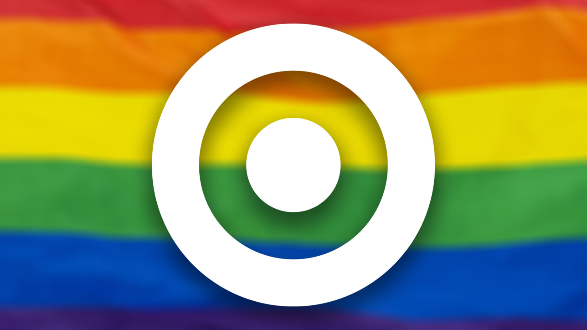
Image credit: Target/Getty Images 1813535811
The collection, described as one of the laziest attempts at Pride branding, is awash with tepid neutrals, empty slogans, and careless design. It stands as a stark example of how not to approach Pride branding, lacking the impactful and meaningful design that the occasion deserves.
Creating impactful branding for Pride requires more than just slapping a rainbow on products. It demands thoughtfulness, creativity, and a genuine commitment to supporting the LGBTQ+ community. Unfortunately, Target's attempt falls short, feeling more like an act of necessity than a show of solidarity.
This serves as a reminder to brands everywhere: Pride is not just a marketing opportunity. It's a time to reflect, support, and celebrate the LGBTQ+ community in a way that's respectful and meaningful.


Comments
Join Our Community
Sign up to share your thoughts, engage with others, and become part of our growing community.
No comments yet
Be the first to share your thoughts and start the conversation!