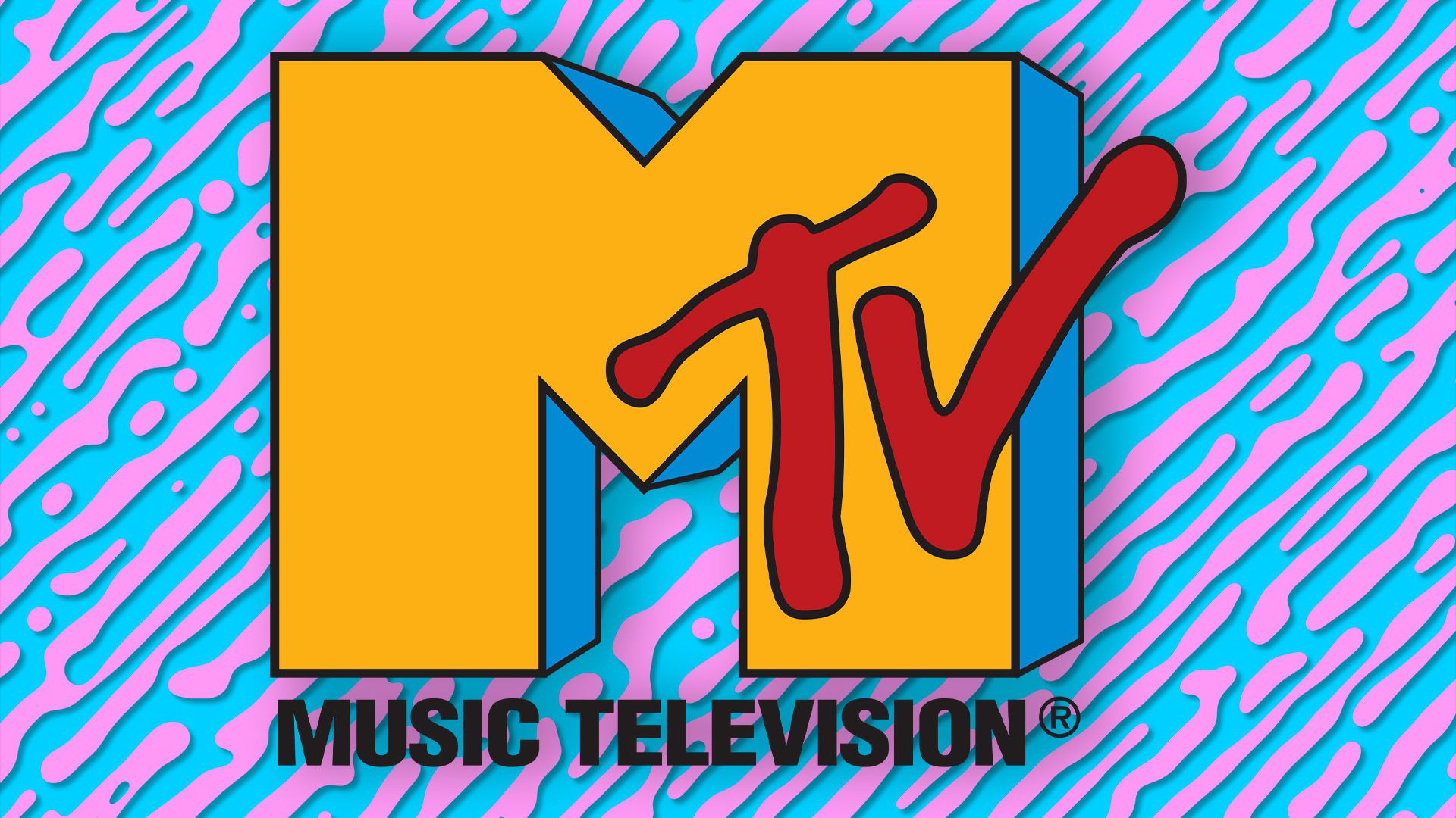
When we think of '80s aesthetics, no design quite embodies the era like the MTV logo. Evolving into a pop culture icon across the decades, the timeless identity has had a lasting legacy in the design world, never losing sight of its retro roots. With news that it is shutting down its five UK channels, we look at its graphic design and how it has evolved to stay relevant.
It's no surprise that the MTV logo has earned a rightful spot on our list of the best logos of all time, thanks to its adaptable yet unmistakable design. Transcending generations evolving from CDs to streaming services, the MTV logo is just as iconic four decades on.
The MTV Logo History: 1981
MTV wasn't just a pioneer in the design world; it reshaped the world of TV as we know it. Debuting as the first 24/7 music network, the channel was aimed at an emerging audience of young music fans – but it needed a logo with attitude to match.
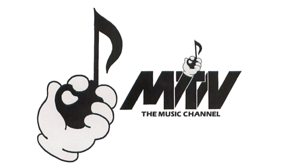
Teaming up with TV producer Fred Siebert, Viacom executive Robert W. Pittman pitched the concept, and the pair soon enlisted the help of Manhattan Design's Pat Gorman and Frank Olinsky. After vigorous hours of sketching, they found the perfect design – a cartoonish hand holding a musical note – the trouble was, the board of management wasn't a fan.
Going back to the drawing board, the team devised a design that incorporated the 'Music Television' namesake, opting for a stylised serif reading “MTV”. With the original cartoonish illustration, the bold typography created a strange, messy dissonance that simply didn't harmonise. In a later interview, Siebert admitted the design was "awful". It was back to the drawing board (again).
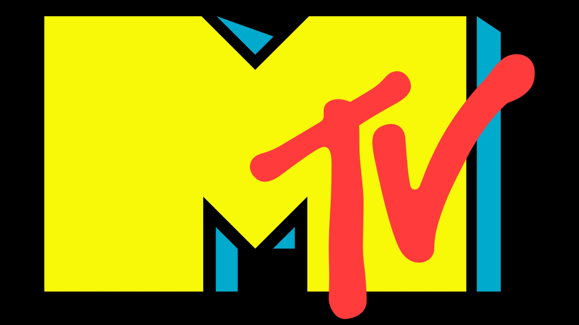
Music Television is Born: 1981–1994
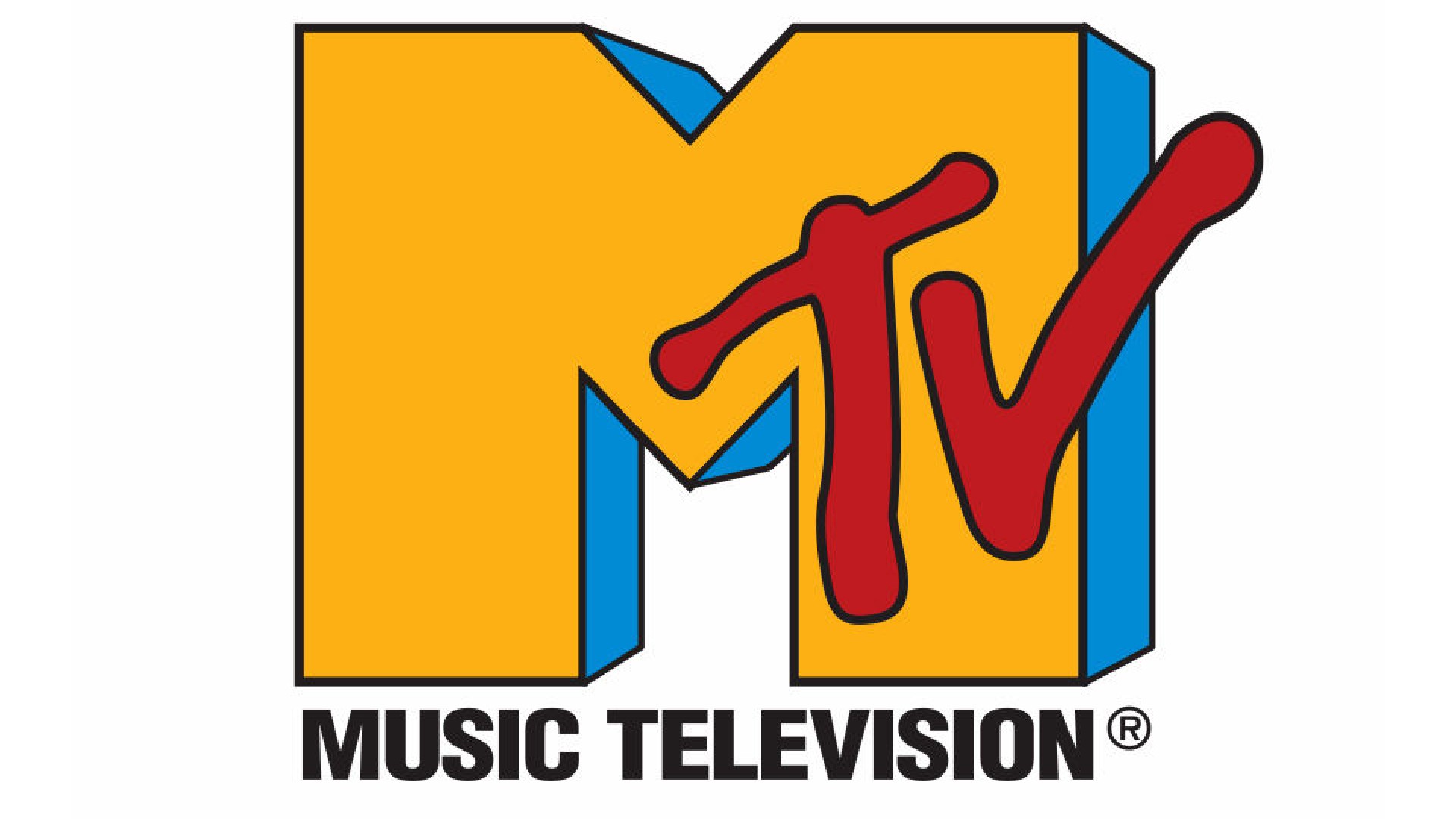
On August 1st 1981, Music Television was officially launched, and with it came a swanky new logo. Following the bold typographical beats of the scrapped logo, the design featured a striking 3D 'M', accompanied by a spray-painted style font for "TV".
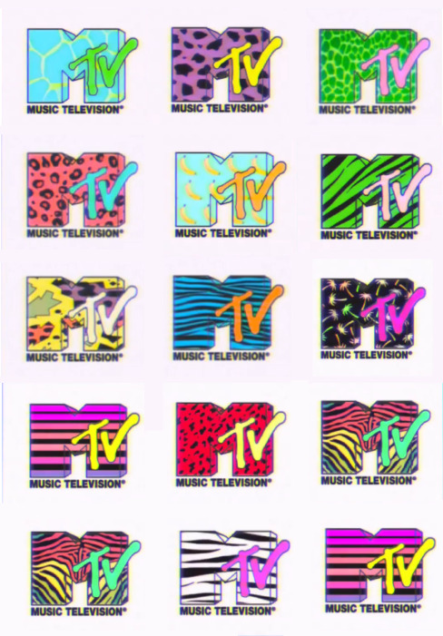
Equal parts playful and powerful, the street art style design against the strong 'M' created a contemporary, scalable logo. From its conception, the MTV logo has never rocked a fixed colour scheme, making it ripe for creative freedom, leading to countless designs across the decades.
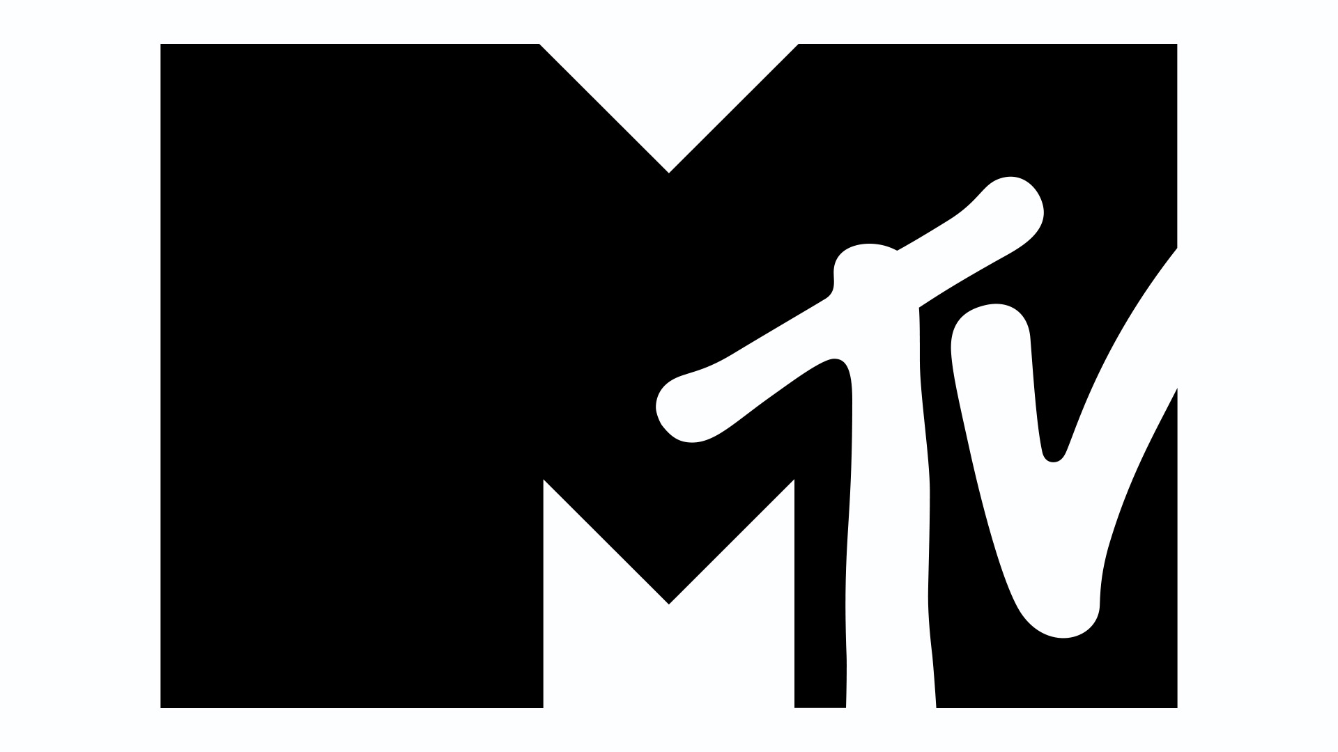
A Subtle Reinvention: 1994–2010
The iconic logo saw its first redesign in 1994, with a grungier look for the 'M', now depicted in Black Helvetica. While the structural tweaks were minor, making for a flattened height and chunkier block lettering, the overall design maintained its playful, youthful appeal, making it perfect for branding and merchandising.
Adapting to the Post TV Era: 2010–2021
With the rise of the internet taking over traditional TV entertainment, MTV began to see ratings fall. Soon, the network began to dip its metaphorical toes into reality TV like Teen Mom and Jersey Shore, making the 'music television' tag feel less applicable.
A new logo arose, sans 'Music Television' tag, ushering in a cleaner version of the design. Created by Universal Everything, the logo's height was subtly squashed, reinforcing its utility as a frame for creativity and promo. From 2010 onwards, the logo was often seen with bold, block colours, a stark difference to the playfulness of the '80s era.
MTV Today: 2021–Present
On February 5 2021, MTV introduced a stripped-back version of its logo to work alongside the 2010 design. Used mainly for on-air promos of its current programming, the design features a condensed, monochromatic look with a 2D 'M' motif. While it's still recognisable, the refined look is scalable and legible across all screens, adapting for the smartphone era.
Sadly, a recent announcement revealed that MTV will be shut down by 31 December 2025, seeing the end of MTV Music, MTV 80s, MTV 90s, Club MTV and MTV Live. While its TV legacy may be laid to rest, the brand is still going strong on socials, proving that a timeless identity can prevail through the decades.

Comments
Join Our Community
Sign up to share your thoughts, engage with others, and become part of our growing community.
No comments yet
Be the first to share your thoughts and start the conversation!