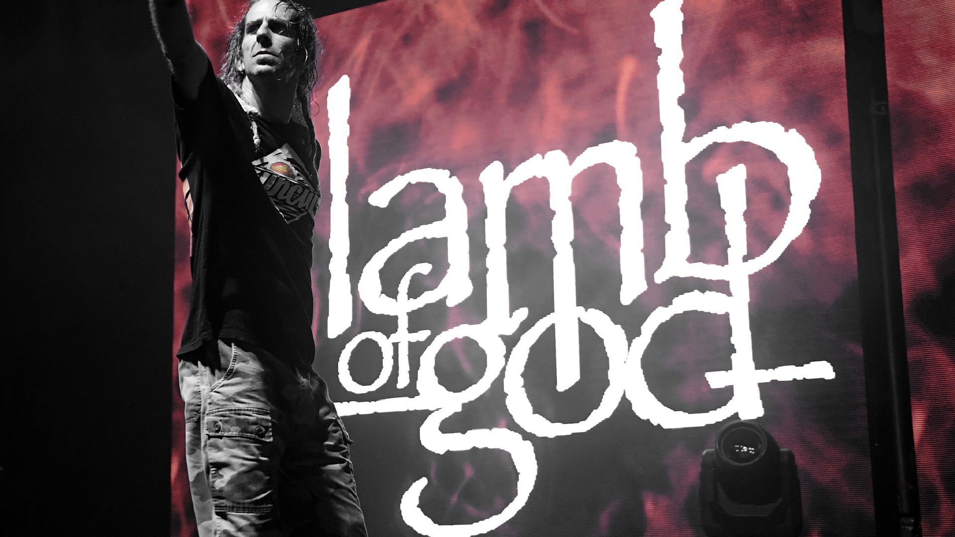
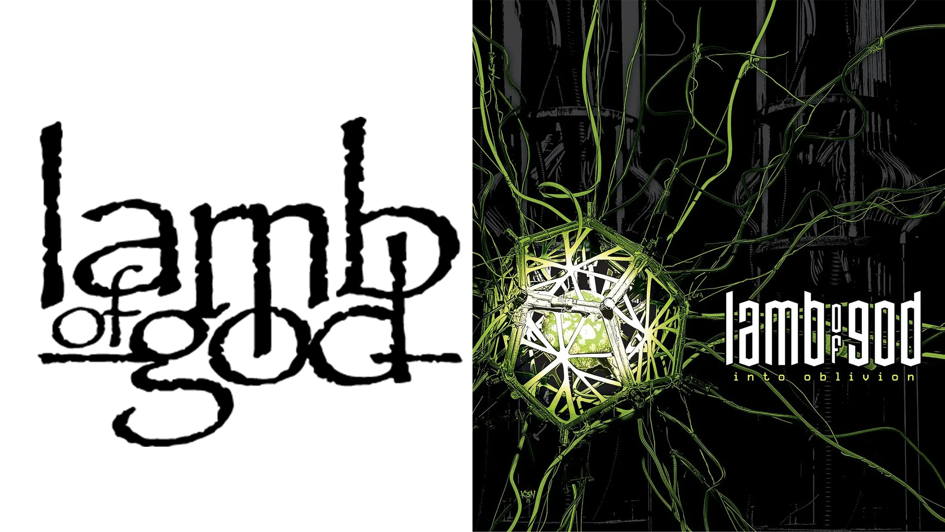
Metal band Lamb of God has retired their iconic wordmark logo after 22 years of action, ushering in a fresh modern era. Comparing the old design to a "falafel restaurant menu," it seems the band had outgrown the logo, calling for a modern revamp.
While the band seems happy with the upgrade, some fans were distraught by the change, claiming that the new design had lost the band's signature style. While new band logos are never going to please everyone, it's surprising to see how nostalgic fans are for a little bit of Papyrus font.
 (Image credit: Lamb of God)
Since their debut, Lamb of God's Papyrus logo has been synonymous with their identity. While it's slightly dated by modern standards, it was unmistakably tied to the band, making it the perfect brand identifier for the past few decades.
On the Hardlore podcast, Lamb of God frontman Randy Blythe explained the decision, saying, "Our logo, to be perfectly honest, needed changing. It’s the papyrus font. Had we known 20-whatever years ago that we would wind up looking like a falafel restaurant menu, we wouldn’t have used that.”
Stylised, angular and contemporary, the new look is far more minimalist and clean, doing away with the previous scroll-style textured typography. Many fans were quick to criticise the new design, calling it "amateurish", "weak" and "boring". One fan wrote that it gave them "early 2000s numetal energy drink vibes," while another claimed it was "a negative move for the band’s branding."
For more design drama, check out the most controversial rebrands of 2025 or take a look at why it might be time to stop judging brands so quickly.

Comments
Join Our Community
Sign up to share your thoughts, engage with others, and become part of our growing community.
No comments yet
Be the first to share your thoughts and start the conversation!