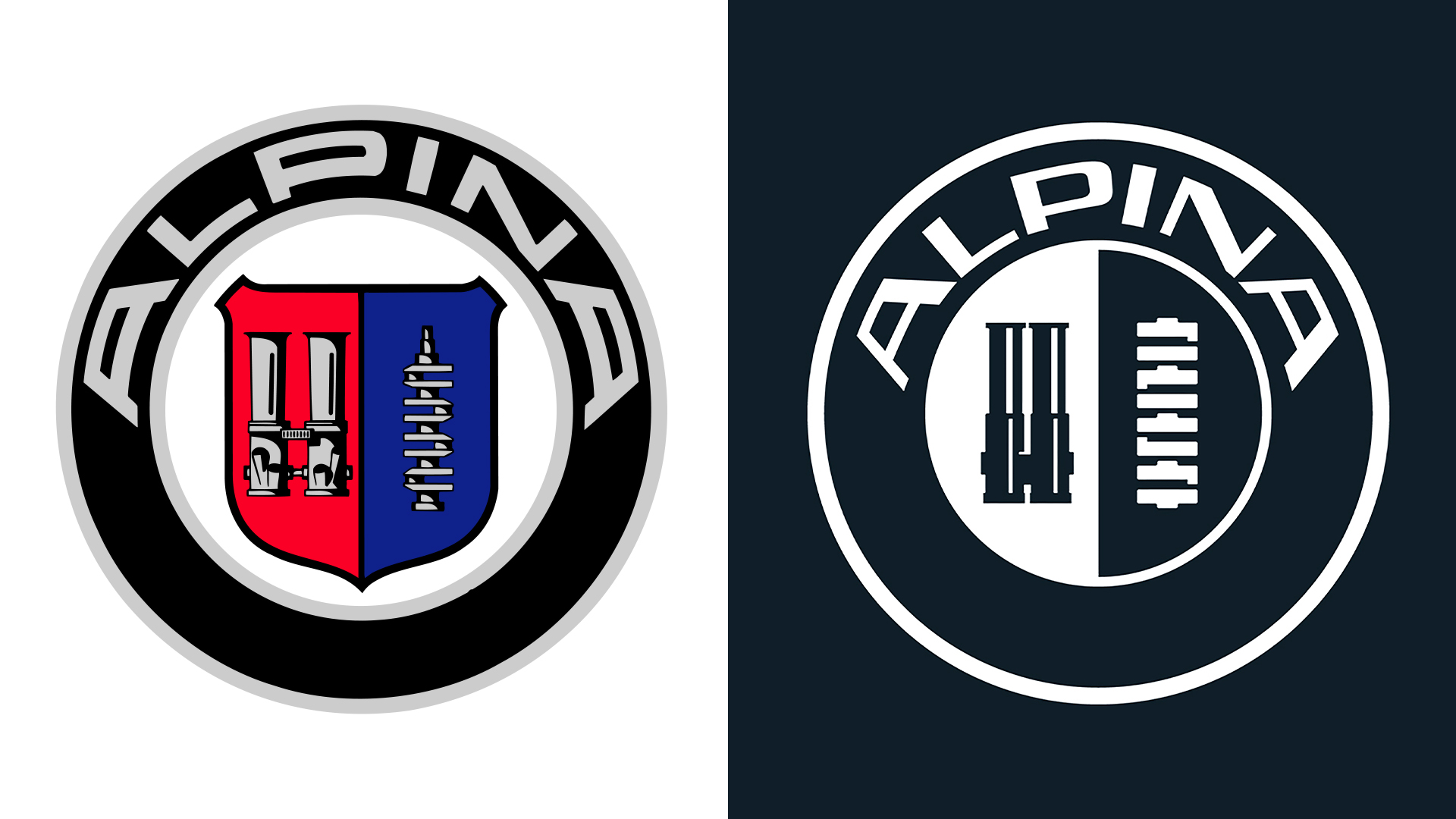
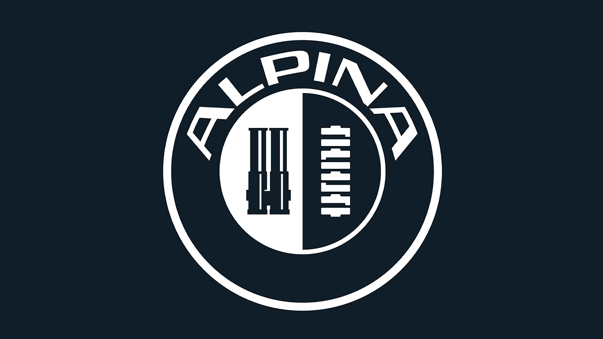
At the start of the year, automotive titan BMW officially launched its new standalone brand, BMW Alpina, with a slick wordmark logo. Today, the brand has further teased its latest sub-brand with a stylish new emblem that links Alpina's rich heritage to its united future with BMW.
As one of the most recognisable car logos of all time, it's no surprise that BMW's new Alpina logo is just as iconic. A refined reimagining of Alpina's heritage logo, the new design is a perfect example of how refinements can be just as impactful as an all-out redesign.

Maintaining key elements of Alpina's original logo, the new design features the same throttle body and crankshaft icons in the centre of the emblem. Refining the old look, Alpina's new logo features a stripped-back palette and transparent design, giving the identity a cleaner appeal compared to its predecessor.
Framing the symbols, the slick wordmark takes inspiration from the asymmetrical design of Alpina's 1970s typeface. A sophisticated refinement of Alpina's heritage identity, the new workmark's clean linework gives the old look a fresh, contemporary feel that oozes luxury.

For more design news, check out the BMW Alpina workmark logo, or take a look at the most iconic car designs of all time.


Comments
Join Our Community
Sign up to share your thoughts, engage with others, and become part of our growing community.
No comments yet
Be the first to share your thoughts and start the conversation!